Wall Art Guide, Wall Art Tutoriels
Orange Wall Art for Living Room: Citrus Warm Main Space Accents
Nov
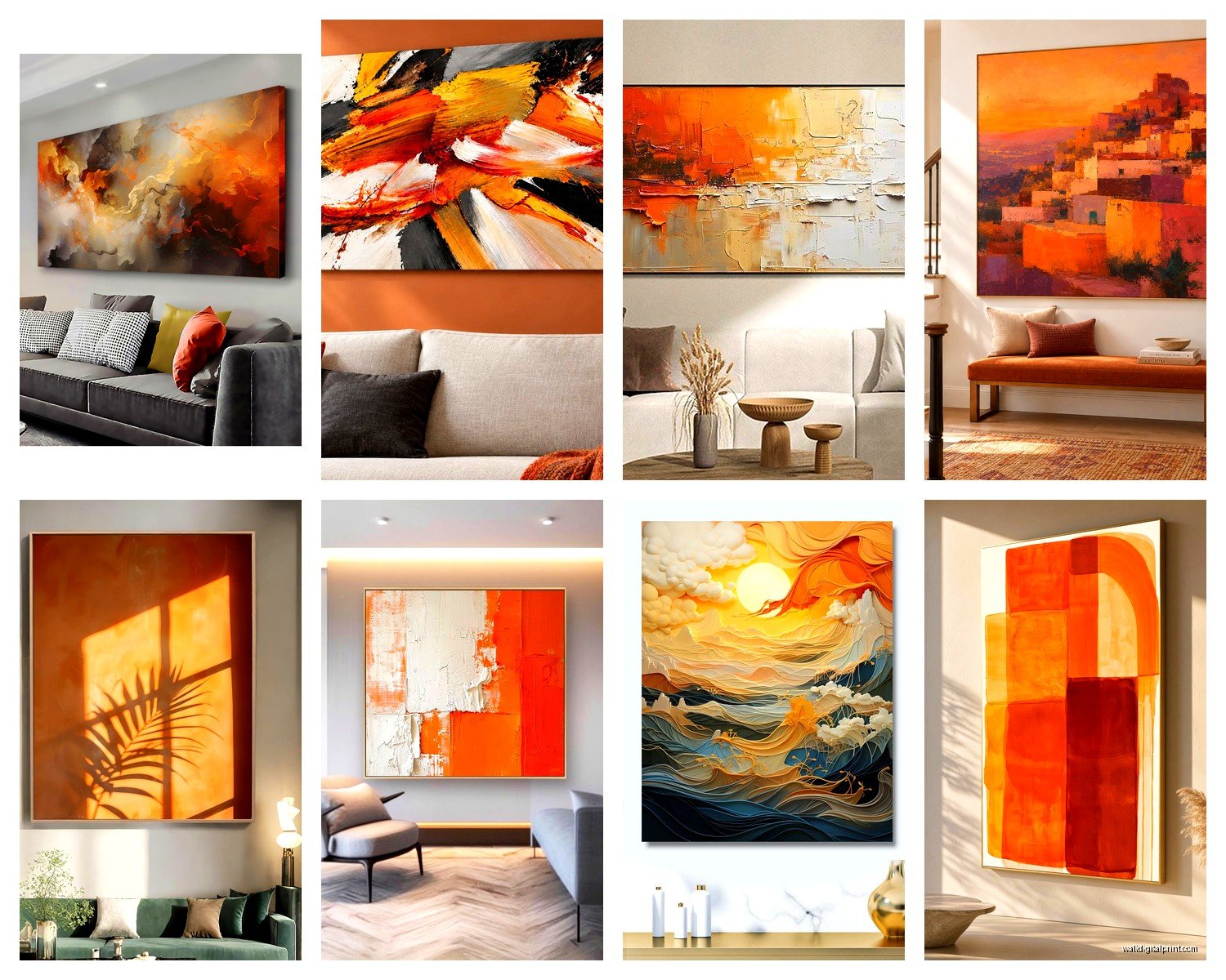
So I’ve been obsessing over orange wall art lately because honestly, it’s the one color that can completely transform a living room without making it look like you’re trying too hard. And I know orange sounds scary at first – I had a client literally tell me “isn’t that gonna look like a pumpkin patch?” but trust me, when you get it right, it’s *chef’s kiss*.
Why Orange Actually Works Better Than You Think
Okay so here’s the thing about orange that nobody tells you. It’s basically the chameleon of warm colors. You can go full terracotta and it reads sophisticated, or you can do bright citrus and suddenly your living room has this energy that makes people actually want to sit and talk instead of scrolling their phones. I tested this theory in my own space last month – put up this burnt orange abstract piece above my couch and my sister visited and didn’t look at her phone once for like two hours. Might be coincidence but I’m taking credit.
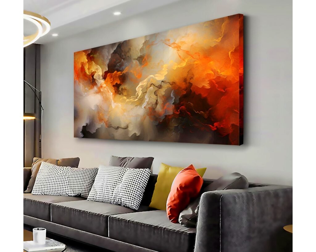
The real magic is that orange plays nice with basically everything you probably already have. Gray couch? Perfect. Cream walls? Even better. That weird beige your landlord painted everything? Orange will make it look intentional.
Picking Your Orange Shade Without Losing Your Mind
This is where people get stuck and I totally get it because there’s like seventeen thousand shades of orange. Here’s how I break it down when I’m curating pieces:
Terracotta/Rust Orange – This is your safe bet if you’re nervous. It’s earthy, grounded, doesn’t scream for attention. Works amazing in living rooms with lots of natural wood or leather furniture. I’ve got a terracotta geometric print in my dining area that everyone assumes cost way more than it did.
Coral/Peachy Orange – Softer, more feminine but not in a weird way. This one’s great if you have cooler tones in your space or if your living room gets tons of natural light. My friend Sarah has this coral abstract in her apartment and it literally glows during golden hour.
Burnt Orange – Deeper, moodier, very 70s but in the good way. Perfect for spaces that lean mid-century modern or if you’re going for that collected-over-time vibe. This is my personal favorite right now because it feels grown-up.
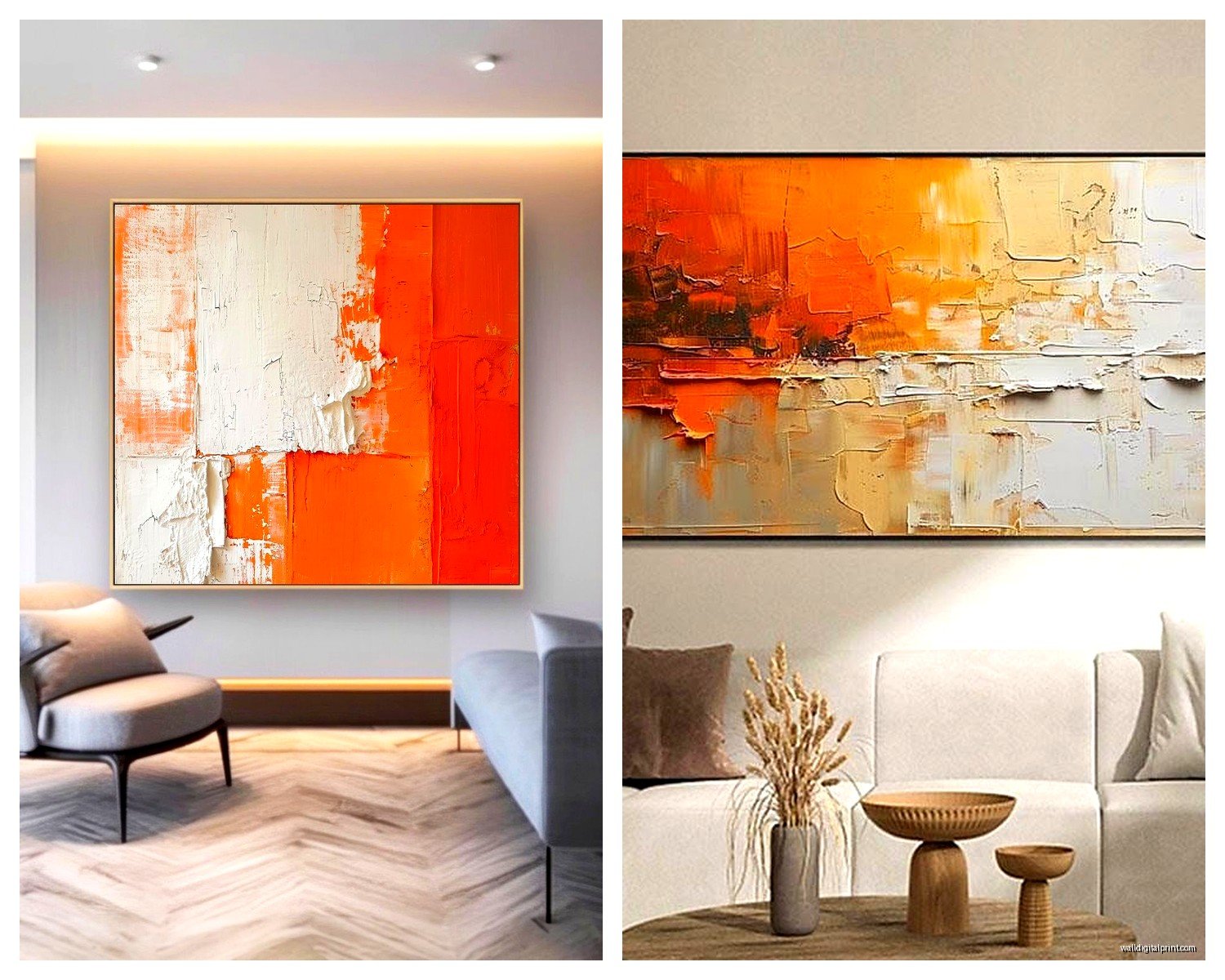
Bright Citrus Orange – Bold choice. Not gonna lie, this one requires commitment. But if your living room is mostly neutral and kinda boring? This’ll fix it real quick. Just don’t go huge with this shade unless you’re really sure.
The Lighting Test Nobody Does But Should
Oh and another thing – before you buy anything, look at orange art samples in your actual living room at different times of day. I cannot stress this enough. Orange changes SO much depending on your lighting. That gorgeous tangerine piece that looked perfect in the store might look weirdly neon under your overhead lights at night. I learned this the hard way with a client’s space where we had to return three different prints because they all looked completely different once installed.
Size and Placement Because Location Matters More Than You Think
Okay so you’ve picked your shade, now where does it actually go? The standard answer is “above the sofa” which, yeah, that works. But let me give you some alternatives that I’ve been using more lately:
Large statement piece above the couch – Classic for a reason. You want something that’s roughly 2/3 to 3/4 the width of your sofa. I see people go too small all the time and it just looks like the art is floating in space awkwardly. For a standard 3-seater sofa, you’re looking at something around 40-50 inches wide minimum.
Gallery wall situation – This is where orange really gets fun because you can mix in different shades and styles. I did this in my own living room with three orange pieces (different sizes, different tones from rust to coral) mixed with black and white prints and some botanical stuff. The trick is to keep the spacing consistent – I use 2-3 inches between frames and it looks intentional instead of chaotic.
Leaning against the wall on a console or shelf – Super casual but in a styled way. This works great if you rent and don’t wanna put holes everywhere. Just make sure the piece is big enough that it doesn’t look like you forgot to hang it. I’m talking at least 24×36 inches.
Unexpected spots – Behind a bar cart, in that weird narrow wall space next to a window, above a side table. My cat knocked over a vase last week and while I was cleaning it up I realized that corner needed art, so now there’s a small orange abstract there and it totally works.
Mixing Orange Art With Your Existing Stuff
This is gonna sound weird but orange is actually super forgiving when it comes to mixing with other colors and decor. Here’s what I’ve tested that actually works:
With blue accents – Complementary colors, very designer-y. If you’ve got blue throw pillows or a blue rug, orange art will make both look more expensive somehow. It’s science or color theory or something.
With green plants – Obviously this works because nature already figured it out. But specifically, orange art makes your plant situation look more intentional. Like you’re not just hoarding pothos, you’re creating a vibe.
With neutral everything – If your living room is beige, gray, white, cream… orange art is literally the easiest way to add personality without buying all new furniture. I had a client with the most boring apartment and we added one large burnt orange piece and suddenly the space had a whole identity.
With metallics – Gold frames with orange art? *Yes*. Brass accents on your coffee table with citrus orange on the walls? Also yes. Copper anything? You’re basically styling my dream living room at that point.
Frame Choices That Won’t Ruin Everything
Okay so funny story, I once spent $300 on this gorgeous orange abstract print and then put it in a $15 frame from a big box store and it looked… not great. Frames matter way more than I wanted them to.
Natural wood frames – Safe choice that works with literally any shade of orange. Light oak for brighter oranges, walnut for deeper tones. This is my go-to recommendation when people don’t wanna think about it too much.
Black frames – Makes the orange pop, very graphic, modern. Works best with geometric or abstract orange art. Can feel a bit stark if your living room is super cozy and soft, but if you’re going for clean lines, this is it.
Gold/brass frames – Elevated, fancy without trying too hard. Perfect for terracotta or burnt orange pieces. I used gold frames for my gallery wall and people always ask where I got them (Amazon, but they don’t need to know that).
White frames – Fresh, keeps things light. Great if you’re worried about orange feeling too heavy or warm. This combo works especially well with coral or peachy orange shades.
No frame/canvas edge showing – Actually looks really good with abstract orange art, very casual and collected. Just make sure the canvas is good quality because you’re gonna see those edges.
The Matting Debate
Wait I forgot to mention matting. So matting is that border space between the art and the frame. For orange art, I usually go with white or cream matting if I’m using it at all. It gives the orange some breathing room and makes it feel more gallery-like. But honestly? With bold orange pieces, you can skip the mat entirely and let the art fill the frame. Depends on your vibe.
Styles of Orange Art That Don’t Look Dated
Because let’s be real, some orange art definitely gives off “2007 HomeGoods clearance section” vibes. Here’s what’s actually working right now:
Abstract organic shapes – Think blobs, curves, asymmetrical stuff. Very now, pairs well with modern or minimalist spaces. I’ve been seeing this everywhere and it’s not going anywhere soon.
Botanical/floral in orange tones – Not like grandma florals though. More like modern line drawings of leaves or flowers in terracotta or rust. Sophisticated and adds a natural element.
Geometric patterns – Circles, arches, lines in various orange shades. Very mid-century, very “I understand design principles.” Works great for gallery walls where you can mix different geometric pieces.
Landscape photography with orange elements – Desert scenes, sunsets, autumn forests. Brings in that orange warmth without being abstract about it. Good if you want something more literal.
Minimalist line art – Simple drawings or sketches with orange as an accent color. Very European, very “I might have studied abroad.” Adds sophistication without overwhelming.
Textured/mixed media – Pieces with actual texture, woven elements, or layered materials in orange tones. These add dimension and make your wall more interesting. I just hung one in a client’s space and it photographs amazing.
Where to Actually Buy This Stuff
Alright so you’re convinced, you know what shade you want, now where do you find it? I’m gonna give you the real list, not just the obvious places:
Etsy – Tons of independent artists, you can find really unique pieces, and you can literally search “burnt orange abstract art” and get thousands of options. I probably source 40% of my art from here. Pro tip: look for digital downloads if you’re on a budget, then get them printed locally.
Society6 and Redbubble – Good for trendy designs, lots of emerging artists. The quality is pretty consistent and they have tons of size options. I’ve ordered from both multiple times and haven’t been disappointed yet.
Local art fairs and markets – Okay this requires actually leaving your house but you can find original pieces and support local artists. Plus you can see the colors in person which is huge with orange.
Vintage/thrift stores – You gotta dig but sometimes you find amazing 70s orange art that’s genuinely cool. I found this geometric orange print at a thrift store for $8 and it’s now in my entryway getting compliments constantly.
Print-on-demand services – If you find art you love online, places like Printful or Artifact Uprising can print it large format. Just make sure you have the resolution for it.
My dog just knocked over my coffee while I’m writing this so that’s fun, anyway…
The Actual Installation Part
So you’ve bought your orange art, it arrived, now you gotta get it on the wall without it being crooked or falling down at 3am and scaring you half to death (yes this happened to me).
Height matters – The center of your art should be at eye level, which is roughly 57-60 inches from the floor. For above-the-sofa situations, leave 6-8 inches between the couch back and the bottom of the frame.
Use proper hardware – Don’t cheap out on picture hanging supplies. For anything over 10 pounds, use wall anchors or find a stud. I’ve seen too many pieces crash down because people used a tiny nail in drywall.
Level everything – Download a level app on your phone if you don’t have an actual level. Nothing ruins orange art faster than it being obviously tilted. Well, that and bad lighting.
Gallery wall planning – If you’re doing multiple pieces, lay them out on the floor first and take a photo. Then trace the frames on kraft paper, tape the paper to the wall, and nail through the paper. Remove paper, hang art. This method has saved me so much frustration.
Styling Around Your Orange Art
Once your art is up, you might wanna echo that orange elsewhere so it doesn’t look random. But like, don’t go overboard. You’re not decorating for Halloween.
Small orange accents – throw pillows, a vase, a blanket, candles. Just little hits of the same tone so the art feels connected to the space. I usually do 2-3 orange accessories max.
Contrast with cool tones – Add in some blue, green, or gray elements to balance the warmth. This keeps your living room from feeling too hot or overwhelming.
Layer in neutrals – Cream, beige, tan, ivory. These let your orange art be the star without competing.
Bring in natural materials – Rattan, jute, wood, plants. These pair beautifully with orange and create this earthy, collected vibe.
What If You Hate It After All This
Real talk – sometimes you try something and it just doesn’t work in your space. That’s fine. Orange art is actually pretty easy to resell or repurpose. I’ve moved pieces to my bedroom, bathroom, or home office when they didn’t work in the living room. Or you can swap with friends, donate it, or list it online.
The good news is that orange has gotten really popular so if you decide it’s not for you, someone else will probably want it. And worst case? You tried something bold and learned what you don’t like, which is just as valuable as knowing what you do like.
Okay I think that’s everything I’ve learned from working with orange art in probably fifty different living rooms at this point. It’s genuinely one of my favorite colors to work with because the transformation is always dramatic but in a good way, not in a “what were we thinking” way. Just start with one piece, see how you feel, and build from there. You don’t gotta commit to an all-orange situation right away.