Wall Art Guide, Wall Art Tutoriels
Poodle Wall Art: Dog Breed Portrait & French Decor
Jun
So I’ve been obsessing over poodle wall art lately and honestly it started because my friend Margot got this ridiculously chic portrait of her standard poodle and I was like… wait, this could actually work in so many rooms that need that French thing without being too literal about it.
The thing with poodle art is it walks this really specific line between playful and sophisticated, which is exactly what you want when you’re trying to do that Parisian apartment vibe but don’t wanna go full Eiffel Tower poster, you know? I’ve tested a bunch of different styles in client spaces and my own studio, and there’s definitely a right way to do this without it looking like you’re just really into dogs.
Finding the Right Style Portrait
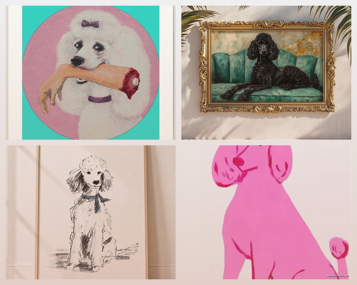
Okay so first thing – the style matters SO much more than you’d think. I put a realistic oil painting style poodle in a client’s dining room last month and it was gorgeous but also kinda formal? Like it needed the rest of the room to match that energy. Versus the line drawing portraits which are way more versatile.
The vintage-style illustrations work best honestly. There’s this whole category of French poodle salon posters from like the 1950s-60s that you can find as reproductions, and they’re perfect because they already have that authentic French commercial art aesthetic. I found one on Etsy that was supposedly a reproduction of an actual Parisian grooming salon advertisement and it had this beautiful muted color palette – dusty pink, cream, black obviously for the poodle.
Line art is gonna be your safest bet if you’re not sure. Single-line continuous drawings of poodles have this elegant simplicity that reads as intentional and curated rather than “I just really love my dog breed.” I used one in a minimalist bedroom and it totally worked because it didn’t compete with anything else.
Wait I forgot to mention – the color of the poodle in the portrait actually matters for your room. Black poodles give you this dramatic contrast that’s amazing for lighter walls, but white or apricot poodles can feel softer and work better in spaces that already have a lot going on. I learned this the hard way when I put a black poodle portrait in a room with dark navy walls and it just… disappeared unless you had the right lighting.
Sizing and Placement That Actually Works
This is where people mess up constantly. They either go too small and it looks like an afterthought, or too big and it dominates in a weird way.
For a standard living room wall, you want something in the 24×36 inch range minimum. I know that sounds big but trust me, anything smaller just looks tentative. I did a gallery wall with three 16×20 poodle portraits in different poses and that worked because it was a collection, but a single small portrait just feels lost.
Above a console table or sideboard? That’s like the perfect spot for poodle art. The proportions work because you’ve got the furniture grounding it. I usually do a portrait that’s about two-thirds the width of the furniture piece below it. So if your console is 48 inches wide, aim for something around 30-32 inches wide.
Bedrooms are tricky – you don’t want it directly over the bed unless it’s part of a larger gallery situation. I’ve had better luck putting poodle portraits on the wall opposite the bed or on a side wall where you see it when you enter. There’s something about having a dog staring at you while you sleep that’s just… yeah.
Oh and another thing – bathrooms! This is gonna sound weird but poodle art in a powder room is chef’s kiss. It’s unexpected, it’s a little whimsical without being childish, and it gives people something to look at. I did a small vintage poodle grooming poster in a half bath and everyone comments on it. The humidity isn’t great for original art obviously so stick with prints or canvas.
The Frame Situation
Okay so frames are where you can either elevate this or make it look cheap. I’m gonna be real with you – those thin black metal frames from IKEA actually work great for this. The RIBBA or FISKBO frames give you that gallery-minimal look that lets the art be the focus.
For a more French look though, you want either a gilded frame (but not too ornate or it gets grandma-ish) or a simple wood frame in a natural or white finish. I found these amazing slim gold frames at an estate sale that had just enough detail without being fussy, and they’re perfect for poodle portraits because they reference that classical European portrait tradition.
The matting choice matters too – I almost always use an off-white or cream mat rather than pure white because it feels softer and more vintage. Wide mats (like 3-4 inches) make smaller prints feel more substantial and considered.
Mixing Poodle Art with Other French Decor Elements
So here’s where it gets fun – you can’t just slap a poodle portrait on the wall and call it French decor. Well you can, but it works better when you’re building a whole thing.
I like pairing poodle art with:
- Vintage French advertisement posters (but not too many or it’s theme-park-y)
- Bistro-style furniture like bentwood chairs or marble-top tables
- Linen textiles in neutral colors
- Fresh flowers in simple glass vases – peonies if you can get them
- Those classic French wire baskets
- Herringbone or chevron patterns in small doses
The key is restraint honestly. My client Sarah wanted to do a full French thing and we did the poodle portrait, some toile pillows, a vintage French mirror, and called it done. Any more and it would’ve been costume-y.
Color palette wise, you’re working with blacks, whites, creams, grays, maybe some dusty rose or pale blue. The poodle portrait often becomes your black element which anchors everything else. I was watching Emily in Paris the other night (don’t judge me) and noticed they actually do this in several scenes – poodle imagery mixed with very neutral French apartment aesthetics.
Where to Actually Buy This Stuff
Etsy is honestly your best bet for variety. There are tons of sellers doing vintage reproduction prints, custom portraits, and digital downloads you can print yourself. The digital download route is cheap but you gotta handle the printing and framing which can end up costing more than you think if you want good quality.
I’ve ordered from a few different Etsy shops – look for sellers who show the print quality in their photos and have lots of reviews. Some are just dropshipping low-res images which look pixelated when printed large.
Society6 and Redbubble have some good options too, especially if you want it on canvas or as a tapestry (which yeah, sounds weird, but a poodle tapestry in a small space can actually work as a soft alternative to a framed piece).
For higher-end stuff, I’ve found amazing vintage original poodle prints at estate sales and antique shops. These are usually from the 50s-70s when poodles were like THE fashionable dog, and they have this authentic quality you can’t replicate. They’re more expensive obviously – I paid $120 for a really beautiful lithograph last year – but it’s a one-of-a-kind thing.
Local artists are worth checking out too. I commissioned a custom poodle portrait from an illustrator on Instagram and it was like $200 for a 24×36 watercolor that’s honestly stunning. If you go this route, look at their portfolio carefully to make sure their style matches what you want.
The Custom Portrait Question
People always ask me about getting their actual poodle painted versus using generic poodle art. Here’s my take – if you have a poodle and you love them, absolutely do a custom portrait. But make sure the artist’s style is sophisticated enough that it reads as art first, pet portrait second.
I’ve seen too many custom dog portraits that are very talented technically but have this sentimental quality that doesn’t work in a curated space. You want something that could hang in a gallery, not just your vet’s office.
The artists who do well with this usually work in a stylized way – think bold colors, graphic shapes, or that French poster illustration style. Photorealistic can work but it’s harder to pull off without it feeling too personal for guests.
Styling the Wall Around Your Poodle Portrait
Okay so you’ve got your poodle art, now what goes around it? My general rule is less is more. The poodle portrait should be a focal point, not one of twelve things competing for attention.
If you’re doing a gallery wall, limit it to 3-5 pieces total. I did one recently with a large poodle portrait in the center, flanked by two smaller French botanical prints and a vintage Paris map. The poodle was clearly the star but the other pieces supported the theme without overwhelming it.
Shelving near the portrait works great – you can style it with French-inspired objects like:
- Vintage books with worn covers (flea market finds are perfect)
- Small sculptural objects in neutral materials
- A simple vase with one or two stems
- Candles in interesting holders
I’m not big on matching everything too perfectly. Like, you don’t need poodle bookends AND poodle throw pillows AND the poodle portrait. Pick one poodle moment and let it shine.
Plants can work near poodle art if they’re the right kind – think sculptural rather than bushy. A fiddle leaf fig or a simple potted olive tree has that French garden vibe. My cat keeps trying to eat my fiddle leaf which is a whole other issue but anyway.
Lighting Makes or Breaks This
Something I see people overlook constantly – you need proper lighting on your poodle portrait or it just sits there flat and sad. Picture lights are the traditional choice and they work beautifully, especially the brass or bronze ones that have a vintage feel.
I’m also a fan of using track lighting or adjustable wall sconces positioned to highlight the art. You want warm white bulbs (2700-3000K) because cool white makes everything look sterile and kills that French warmth you’re going for.
Natural light is amazing obviously, but be careful with direct sun hitting the portrait because it’ll fade over time. I learned this the expensive way with a vintage print that got washed out after a summer of afternoon sun. UV-protective glass helps if you’re framing something valuable.
Different Rooms Different Vibes
Living room poodle portraits should be elegant and substantial. This is where you can do a larger statement piece, maybe even a triptych of different poodle poses. I prefer black and white or muted colors here because it feels more sophisticated.
Dining rooms can handle more playful or colorful poodle art since there’s something inherently social and fun about dining spaces. I used a vintage poodle cafe poster in a breakfast nook and it totally sets this cheerful French bistro mood.
Home offices are perfect for poodle art actually – it adds personality without being distracting. A single framed print above a desk or on a side wall works great. Just make sure it’s something you actually like looking at because you’ll be staring at it during Zoom calls.
Entryways and hallways need something that makes an immediate impression. A bold poodle portrait right when you walk in says “this person has a point of view” in the best way. Keep the rest of the entry simple so the art can be the welcome moment.
Avoiding the Kitsch Factor
This is the fine line right – poodle art can very easily tip into cutesy territory if you’re not careful. Here’s what keeps it sophisticated:
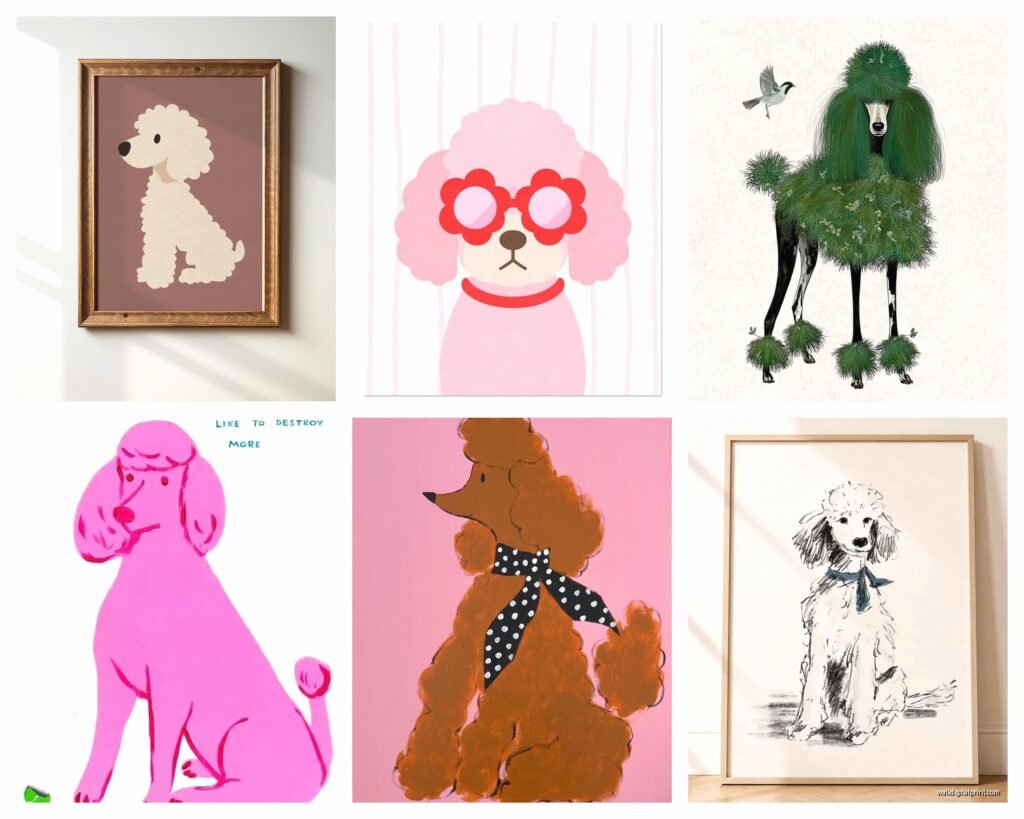
Stick with artistic interpretations rather than cartoon-y styles. The art should have some level of abstraction or stylization that elevates it beyond just “picture of a dog.”
Avoid anything with text unless it’s vintage French text that’s part of the original design. Modern slogans or cute sayings will immediately make it feel less refined.
The color palette should be restrained. Hot pink poodle art exists and it can work in the right space, but you’re playing with fire. Neutrals, blacks, metallics, muted tones are safer.
Size matters for sophistication – tiny poodle portraits feel precious in a way that doesn’t read as curated. Go bigger and bolder.
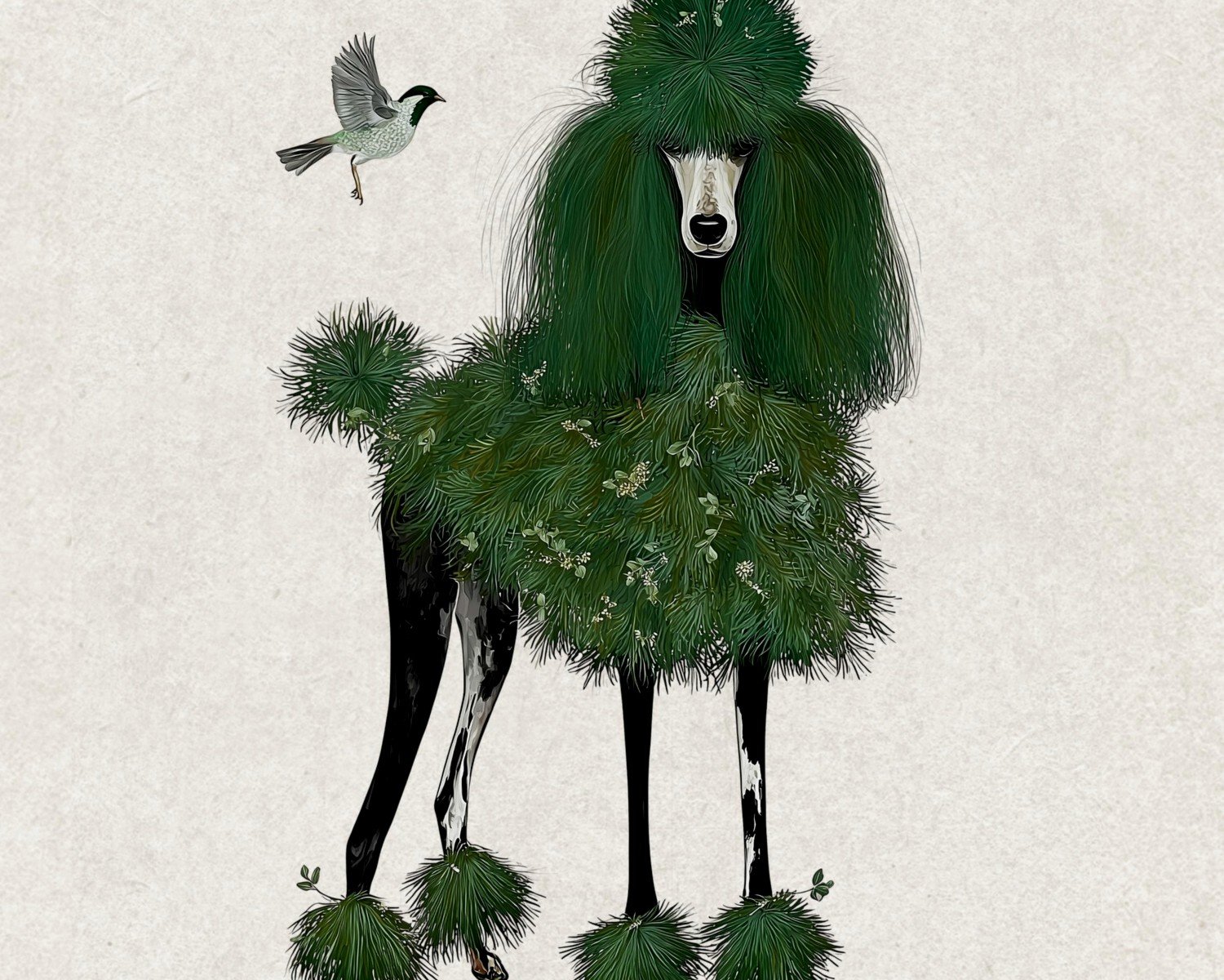
Oh wait I should mention – metallic poodle art is having a moment and I’m here for it. Gold foil poodle silhouettes on black backgrounds are stunning and very French deco. I used one in a client’s art deco inspired bedroom and it was perfect.
The whole thing really comes down to treating the poodle portrait as a legitimate art piece rather than a novelty. When you approach it with that mindset, suddenly it works in spaces where you wouldn’t expect it to, and it brings this specific French elegance that’s hard to achieve any other way.
Just remember to step back and look at the whole room – if the poodle portrait feels like it belongs and enhances the space rather than sticking out awkwardly, you’ve nailed it.