Wall Art Guide, Wall Art Tutoriels
Deadpool Wall Art: Marvel Superhero Comic Decor
Jun
So I’ve been down this rabbit hole with Deadpool wall art lately because a client wanted to do this whole “grown-up comic room” thing and honestly it’s trickier than you’d think to not make it look like a teenager’s bedroom, you know?
Figuring Out Which Type Actually Works
Okay so first thing – there’s like a million types of Deadpool art and most of it is honestly kinda terrible? I spent way too much time scrolling through Amazon and Etsy at like midnight last week when I couldn’t sleep, and here’s what I figured out.
Canvas prints are gonna be your safest bet if you want something that looks intentional and not just poster-board stuck to the wall. The texture hides imperfections better and they read as “actual art” instead of “I love comics” if that makes sense. I usually go for the gallery-wrapped ones where the image continues around the edges because then you don’t need a frame and it looks more expensive than it probably is.
Metal prints are having this moment right now and they work surprisingly well with Deadpool’s aesthetic because the colors pop like crazy. There’s this one I saw with the red suit against a yellow background that looked almost three-dimensional on brushed aluminum. But here’s the thing – they show fingerprints like you wouldn’t believe, so if you have kids or you’re the type who touches everything (guilty), maybe skip these.
Size Matters More Than You Think
This is where everyone messes up including me the first time. You think “oh I’ll get a small piece, test it out” and then it arrives and looks like a postage stamp on your wall. For a living room or bedroom, you want at least 24×36 inches as your anchor piece. I learned this the hard way when I ordered a 16×20 thinking it would be perfect above my couch and it just looked… sad.
If you’re doing a gallery wall situation with multiple Deadpool pieces, you can mix sizes but keep at least one piece at 24 inches minimum on one side. I did three pieces for someone last month – one 30×40 in the center with two 16x20s flanking it, and THAT worked because the proportions made sense together.
The Awkward Wall Size Problem
Oh and another thing – measure your wall space before you get excited about a piece. I cannot tell you how many times I’ve fallen in love with art only to realize it’s either way too big for the space or so small it disappears. The rule I use is the art should take up about two-thirds to three-quarters of the wall width. So if you have a 6-foot wide wall section, you want something around 4-5 feet wide total including frames or spacing between multiple pieces.
What Style Actually Looks Good
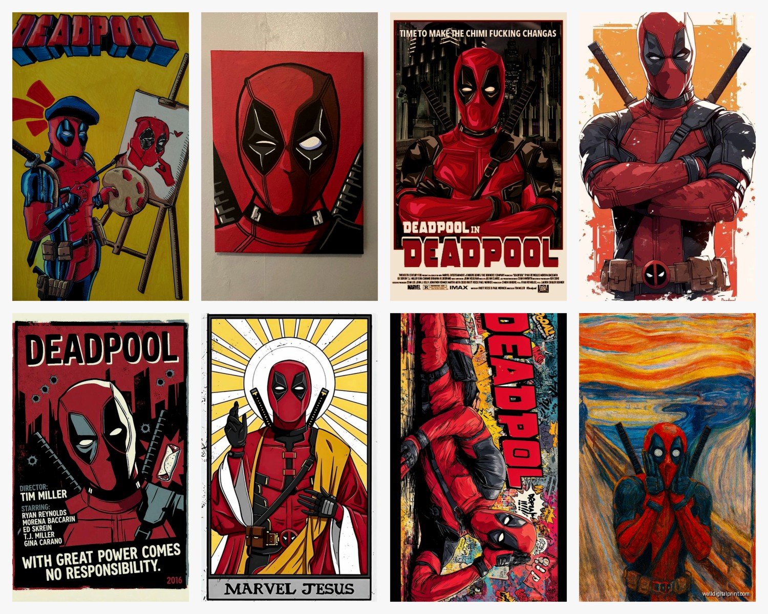
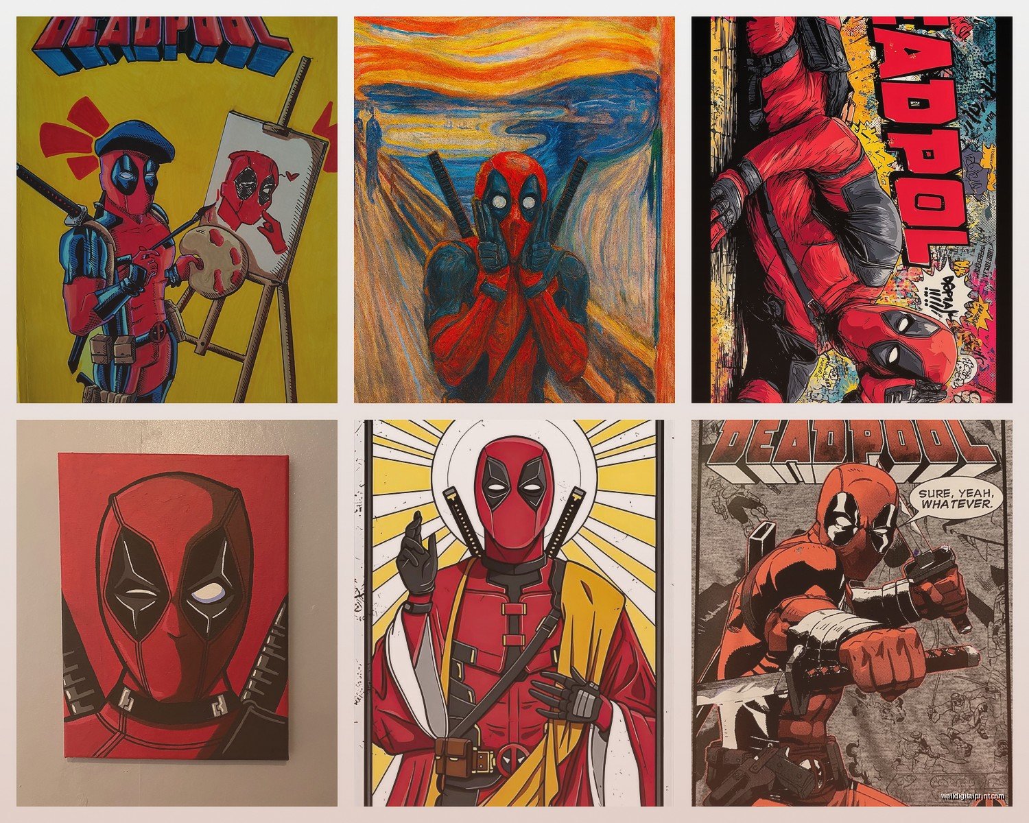
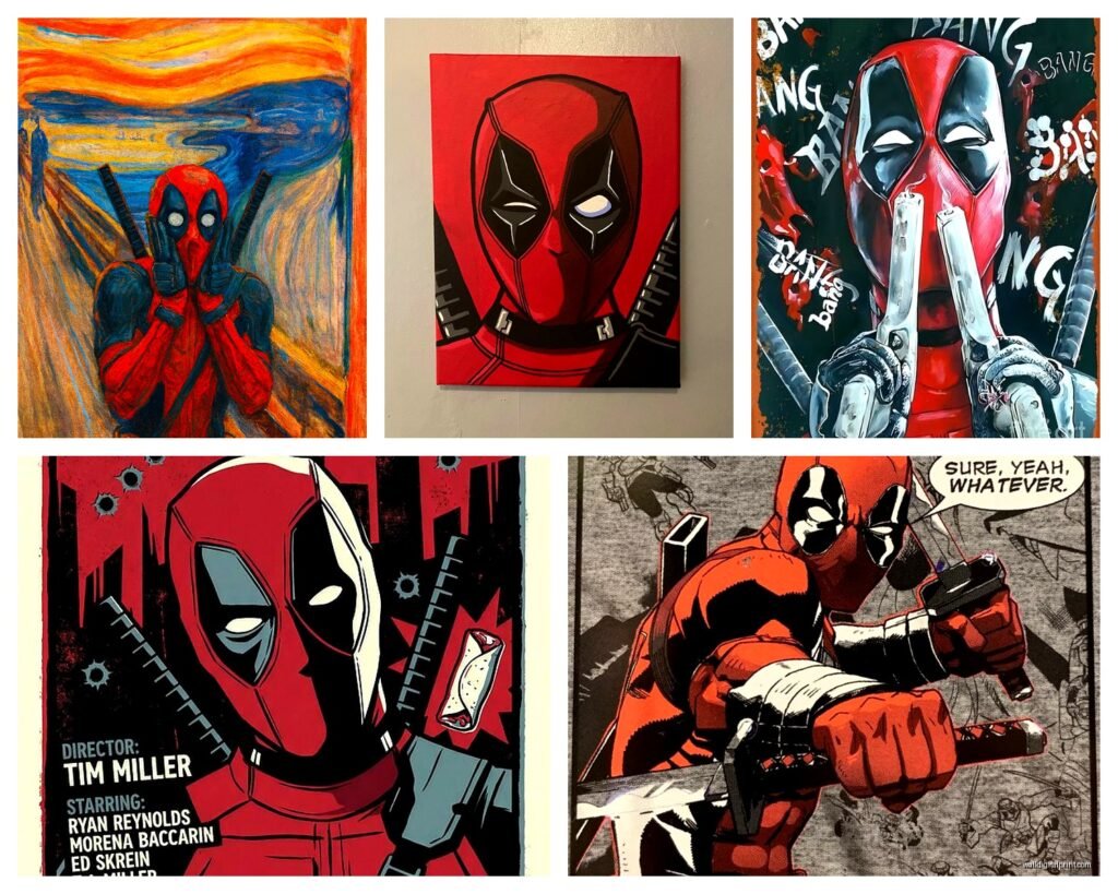
So there’s basically three camps of Deadpool art and they give totally different vibes:
The comic book panel style with the speech bubbles and classic illustrations – this is very on-the-nose, works great in a home office or game room but can feel juvenile in main living spaces. Unless you commit fully to it and make it a whole thing with other Marvel characters and really curate it.
The minimalist/geometric Deadpool where it’s just his mask or silhouette in like solid colors – this is what I usually recommend for people who want the character but also want their place to look adult. There’s this one design that’s just the mask in black and red with clean lines that I’ve used in three different projects and it always works.
The artistic interpretation stuff where someone’s done Deadpool in watercolor or street art style or whatever – hit or miss honestly. I saw one that was like Deadpool as a Renaissance painting and it was either genius or ridiculous, couldn’t decide. My cat knocked over my coffee while I was staring at it trying to figure out if I loved or hated it.
Color Coordination Without Making It Obvious
Here’s what’s annoying about Deadpool specifically – the red and black color scheme is SO strong that it can dominate a room if you’re not careful. I’ve seen spaces where someone put up this massive bright red Deadpool canvas and suddenly the whole room felt like it was yelling at you.
What actually works is pulling one accent color from the art and repeating it elsewhere. So if your Deadpool piece has some yellow or gray in the background, get a throw pillow or a lamp in that color. It sounds basic but it makes the art feel intentional instead of random.
Or go the opposite direction and keep everything else super neutral – grays, whites, blacks – and let the Deadpool piece be the only pop of color. This works especially well in modern or industrial style rooms.
Framing Choices That Don’t Suck
Okay so framing is where people either elevate the art or make it look cheap, there’s no in-between. For Deadpool stuff specifically, I almost always skip traditional frames unless it’s a really high-quality art print.
Black floating frames work well because they give structure without competing with the bold imagery. You want something thin – like 1 inch or less – so it’s not stealing attention. I found some good ones at Target actually that were like $30 and looked way more expensive.
If you’re going frameless with canvas, make sure the edges are finished properly. Some cheaper canvases have the staples showing on the sides and it looks unfinished. Gallery wrap or painted edges are what you want.
Wait I forgot to mention – there are these magnetic poster hangers that have been all over Instagram and they actually work pretty well for comic art. You sandwich the top and bottom of the poster between these wooden or metal bars with magnets, and you can swap out the art whenever. Good if you get bored easily or wanna rotate different characters.
The Frame Color Debate
I had this whole argument with myself about whether colored frames work with Deadpool art. Tried a red frame once thinking it would be cohesive and it was just… too much red. Everything disappeared into itself. Black, white, or natural wood are your friends here. Sometimes a gunmetal gray if you’re going industrial.
Where to Actually Put It
Living room above the couch is obvious but can work if you balance it with other decor. I prefer it on a side wall where it’s a surprise instead of the first thing you see. There’s something fun about turning your head and being like “oh yeah there’s Deadpool.”
Home office is perfect honestly – it’s personality without being unprofessional since it’s your private space. I put a minimalist Deadpool print in my own office and it makes me laugh during boring Zoom calls.
Bedroom is fine if it’s your bedroom and you’re into it, but maybe not the first thing you want guests seeing if they peek in? Unless you’re really committing to the theme.
Game room, media room, home theater – these are like the natural habitat for comic art. You can go bigger and bolder here without it feeling out of place.
This is gonna sound weird but I’ve seen Deadpool art work in a bathroom, specifically a powder room, if it’s a funny quote-based piece. Makes guests laugh and it’s unexpected in a good way.
Mixing With Other Art
You don’t have to make it all Marvel all the time. Actually mixing Deadpool with non-comic art can make both look better. I did a wall where we had a Deadpool canvas next to a black and white photograph and a abstract geometric print, all in black frames, and it looked cohesive because the framing and color palette tied it together.
The trick is finding a common element – could be color, could be frame style, could be theme. I saw someone mix Deadpool with other pop art like Warhol style pieces and it worked because they were all commentary on popular culture in their own way.
Quality Markers to Look For
Okay so when you’re shopping online which is probably where you’ll end up buying this stuff, here’s what actually indicates decent quality:
Canvas should be at least 0.6 inches thick, preferably 1.5 inches if you want it to look substantial. The product description should mention this.
Look for UV-resistant or fade-resistant coating especially if it’s going anywhere near a window. Colors will wash out over time otherwise and Deadpool’s red is not cute when it turns pink.
Check if corners are mitered properly in the product photos – they should have clean 45-degree angles not sloppy folds.
Read reviews specifically about packaging because these ship rolled or flat and damage during shipping is super common. If multiple reviews mention dented corners or creases, skip it.
Print Quality Things Nobody Tells You
Resolution matters even though they don’t always list it. If the image looks pixelated in the product photo, it’ll look worse in person. Zoom in on the photo preview – you should see smooth gradients not visible dots or squares.
Giclee prints are fancy printer speak for high-quality inkjet on canvas or paper. They cost more but the color accuracy is way better and they last longer. Worth it if you’re actually investing in a piece you plan to keep for years.
The Budget Breakdown
You can find Deadpool prints for like $15 on Amazon but they’re gonna look like $15 prints. Not saying don’t buy them, just know what you’re getting.
The sweet spot I’ve found is $40-80 for a decent canvas print in the 24×36 range. You’re getting okay quality that looks fine from conversation distance.
If you want something that’s actually gonna impress people or last more than a couple years, budget $100-200. This gets you better materials, proper mounting, sometimes even licensed official artwork instead of fan art.
Custom or original Deadpool art from actual artists on Etsy or at comic cons – sky’s the limit but I’ve seen amazing pieces in the $200-500 range that are legitimately unique.
Installation Tips Nobody Thinks About
Use a level I’m begging you. Your eye is not as good as you think it is at judging straight lines and crooked art makes everything look cheap.
Command strips work for lighter pieces under 5 pounds but anything bigger needs real wall anchors or studs. I’ve had canvas fall at 2am and it’s not fun.
Height matters – the center of the artwork should be at eye level which is around 57-60 inches from the floor. This is standard gallery height and there’s a reason for it. Adjust if you’re exceptionally tall or short I guess.
If you’re doing multiple pieces, lay them out on the floor first in the arrangement you want, then measure and mark before you start putting holes in walls. Learned this after creating a wall that looked like swiss cheese from all my “adjustments.”
Oh and actually – get those picture hanging hooks with two or three nails instead of one. Distribution of weight makes it way more secure and less likely to go crooked over time.
Listen, at the end of the day Deadpool art is supposed to be fun and a little irreverent so don’t stress too much about getting it perfect. But these tips should help it look intentional instead of accidental, which is the whole point of good decorating anyway.