Wall Art Guide, Wall Art Tutoriels
Cottage Wall Art: Cozy Country Cabin Lake House Decor
May
So I’ve been working on this lake house project for like three months now and honestly the wall art situation is what made the whole place finally feel done, not the fancy furniture or whatever. You’d think it’d be simple but cottage wall art is actually kinda tricky because you don’t want it to look like a Cracker Barrel exploded in there.
Start With Your Actual Wall Space Not Pinterest
Okay so first thing – measure your walls before you fall in love with anything. I cannot tell you how many times I’ve had clients buy this gorgeous vintage canoe paddle art piece only to realize their wall is like 6 feet and the paddle is 8 feet. My dog knocked over my coffee while I was doing measurements last week and I learned this the hard way, just use painters tape on the wall to map out the size you’re thinking. It’s gonna save you so much return shipping.
For cottage spaces you’re usually working with:
- Above the sofa or bed: 60-75% of furniture width
- Narrow walls between windows: go vertical, 18-24 inches wide max
- That weird space above the fireplace: measure the mantel width and subtract 8 inches
- Stairway walls: multiple smaller pieces work better than one big thing
The lighting matters too – if you’ve got those small cottage windows, darker art is gonna disappear. I learned this at my uncle’s cabin where he hung this beautiful moody forest print and you literally couldn’t see it after 4pm.
The Main Cottage Art Categories That Actually Work
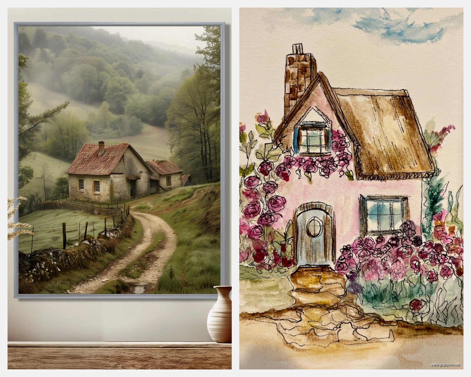
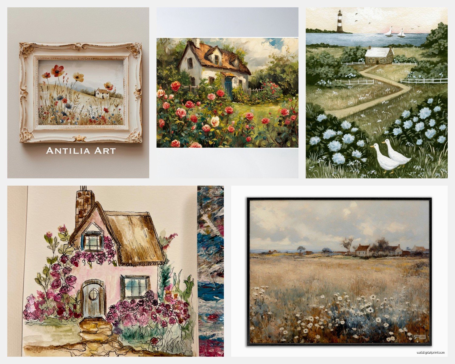
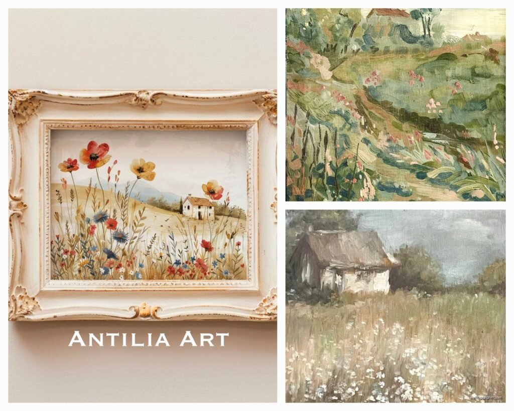
Landscape and Nature Prints
These are the obvious choice but here’s what I’ve figured out – you want them to feel specific not generic. Like those mass-produced “lake at sunset” prints from HomeGoods? Everyone has them. Instead look for:
Vintage national park posters – the WPA style ones from the 1930s-40s. You can get reproduction prints on Etsy for like $20-40 and they have that aged quality without being too precious about it. I just hung three of them in a cabin bedroom and used simple black frames from IKEA and it looked way more expensive than it was.
Botanical prints of actual local plants work great too. If you’re near a lake, get prints of pine branches, birch bark, wildflowers that actually grow there. There’s this seller on Etsy called… wait I gotta find the name… okay I can’t remember but search “vintage botanical prints” and look for ones that aren’t too colorful. The muted greens and browns blend better.
Vintage Maps
Oh and another thing – old topographic maps of your actual area are perfection for cottage walls. I framed a 1960s USGS map of the lake region for a client’s living room and people always ask about it. You can find them on eBay or sometimes the local historical society has them. Get them professionally mounted though because the paper is usually thin and wrinkly.
Wildlife Art But Make It Not Cheesy
This is gonna sound weird but most wildlife art for cottages looks really bad. The airbrushed deer, the overly dramatic eagle stuff… it’s too much. What actually works:
Simple line drawings of fish or birds – black and white is your friend here. I found these minimalist trout prints that are just the outline and they’re so much better than those realistic bass jumping out of water paintings.
Vintage Audubon-style bird prints – but the lesser-known birds, not just the eagles and cardinals everyone uses. Look for the warblers, woodpeckers, shore birds. They have more interesting colors and shapes.
Gallery Wall Layouts for Cottage Spaces
Okay so funny story, I tried to do a symmetrical gallery wall at my first cabin project and it looked super weird because cottage architecture is never symmetrical. The windows are off-center, the beams are irregular, everything’s a bit wonky. So I stopped fighting it.
For cottage gallery walls:
The casual cluster approach – this is where you group 4-6 pieces kind of organically. Not in a perfect grid but not random either. I usually do one larger piece (like 16×20) as an anchor and then 3-4 smaller ones (8×10 or 11×14) around it. Leave like 2-3 inches between frames. Use matching frames in the same finish – all black, all natural wood, all white – because the cottage itself already has enough visual texture.
The horizontal row – three to five pieces all in a straight line. This works above sofas or beds where you want something calmer. Keep them all the same height frames, doesn’t matter if the art inside is different orientations. I just did this with vintage fishing lure advertisements and it’s probably my favorite thing I’ve done this year.
The leaning situation – if you have a mantel or a deep shelf, just lean art against the wall instead of hanging it. Layer smaller pieces in front of larger ones. This is great for renters or if you’re still figuring out what you like. My cat keeps knocking these over though so maybe secure them with that museum putty stuff.
Frame Choices That Don’t Suck
I’ve wasted so much money on frames let me just tell you what works:
Natural wood frames in light or medium tones – the really dark espresso frames feel too formal for cottage spaces. Look for oak, maple, or pine frames with visible grain. IKEA’s HOVSTA series is actually good for this and they’re cheap.
Simple black frames – but only if your cottage has some black elements already like window frames or door hardware. Otherwise they can look too modern and stark.
White frames – these work in more beachy lake houses but can feel too clean for rustic cabins. I use them mostly in bedrooms where you want it lighter and airier.
What doesn’t work: ornate gold frames (too fancy), distressed painted frames (trying too hard to be cottage-y), those chunky barnwood frames (unless you actually made them from your own barn).
Matting Yes or No
For cottage art I usually do mat only if the print itself has dark edges or if it’s a vintage piece that needs some breathing room. White or cream mats in like 2-3 inch width. But honestly for a more casual cottage vibe, no mat and just floating the print in the frame works fine too.
Where to Actually Buy This Stuff
Etsy is gonna be your best friend for vintage prints and reproductions. Search terms that work: “vintage national park poster,” “antique botanical print,” “retro lake life,” “vintage fishing print.” Filter by price and read reviews because some sellers just print pixelated jpegs.
Flea markets and antique stores near lake areas – I found the best stuff at a random barn sale in upstate New York. Old fishing licenses, vintage canoe advertisements, hand-drawn maps. Frame these yourself and they’re one of a kind.
Society6 and Minted have some good artists doing modern nature art if you want something contemporary but still nature-focused. Look for watercolor styles or simple graphic designs.
Wait I forgot to mention – local artists near your cottage area often sell prints at farmers markets or small galleries. These are great because the landscapes will actually look like your specific region. Plus you can tell people you support local artists which sounds good.
The Stuff You Hang Besides Framed Art
Because it can’t all be prints or it gets boring:
Vintage oars or paddles – but only if you actually use them or found them somewhere meaningful. Don’t just buy decorative oars from HomeGoods. I have strong feelings about this. Real ones have character and dings and faded paint.
Woven baskets – hang a collection of flat baskets in different sizes on a wall. This adds texture and works especially well in dining areas or entries. My client thought I was crazy but then it looked amazing.
Antique snowshoes or fishing nets – if they’re actually old and weathered. New ones trying to look old are obvious and sad.
Floating shelves with small objects – this isn’t technically wall art but it breaks up the framed pieces. Put vintage thermoses, old binoculars, a small plant, some rocks from the lake.
Color Palette Stuff You Gotta Think About
Your cottage walls are probably wood paneling or painted in some neutral color right? So your art needs to either blend gently or provide intentional contrast.
For natural wood walls – blues and greens look incredible because they pull in the lake and forest vibes without being too matchy. Avoid reds and oranges unless they’re really muted because they can clash with the warm wood tones.
For white or cream painted walls – you have more flexibility but don’t go too colorful or it stops feeling like a cottage and starts feeling like a beach house. Stick with nature’s actual color palette: forest greens, sky blues, sandy beiges, gray-blues, rust browns.
For dark painted walls (like navy or forest green which are trendy right now) – you need art with lighter elements so it doesn’t disappear. White mats help here, or prints with significant white/light areas in them.
The Vibe Check
This is gonna sound weird but before you hang anything, hold it up on the wall and leave the room, then come back in like you’re arriving at the cottage for the weekend. Does it make you feel relaxed or does it feel like you’re trying too hard? Cottage art should fade into the background a bit – it’s supporting the vibe not demanding attention.
I was watching that renovation show the other night and they put this huge colorful abstract painting in a cabin and it just felt wrong, you know? Like the painting was screaming for attention when the whole point of a cottage is to chill out.
Practical Hanging Tips
Use proper wall anchors especially in old cottages where the walls might be funky. I’ve had frames fall because someone just used a regular nail in drywall. Get the ones rated for the weight of your frame.
Hang art at eye level which is usually 57-60 inches from the floor to the center of the frame. But in rooms where you’re mostly sitting (like living rooms) you can go slightly lower.
For wood paneling walls – find the studs or use those special paneling hangers. Regular drywall anchors don’t work in paneling.
Command strips work fine for lightweight prints under 5 pounds and they don’t damage walls which is great for rentals or if you change your mind a lot like I do.
What Not to Do
Don’t theme too hard – like an entire room of fish art or all bears everywhere. Pick a general nature vibe and vary it.
Don’t use sayings and quotes – “Lake Life” and “The Mountains Are Calling” and all that stuff feels really dated now. Just show the lake or mountains instead of announcing them.
Don’t hang art too high – this is the most common mistake I see. It shouldn’t be floating up near the ceiling, it should be at a human viewing level.
Don’t match everything perfectly – cottages should feel collected over time not bought all at once from the same store.
The whole point is making your cottage feel personal and relaxed, and the wall art is honestly what does most of that heavy lifting once you get the basics right. Start with one or two pieces you really love and build from there instead of trying to do everything at once.