Wall Art Guide, Wall Art Tutoriels
Zebra Print Wall Art: Black White Striped Animal Pattern
Aug
So I’ve been obsessing over zebra print lately and honestly it’s one of those patterns that can go SO wrong but when you get it right, it’s absolutely stunning. Like, I just finished styling a client’s living room with zebra wall art and now I’m kind of a convert.
Okay first thing – you gotta decide if you want actual photography or the more graphic illustration style. The photography ones are amazing if you want that National Geographic vibe, really dramatic and realistic. I found this incredible set on Etsy from a wildlife photographer who shoots in Tanzania and the detail is insane. You can see individual hairs and the texture of the zebra’s coat. But here’s the thing – photographic prints need GOOD lighting in your room or they can look muddy and flat. I made that mistake in my home office and had to move it to a wall with better natural light.
The graphic illustrations though, those high contrast black and white vector-style prints? They work basically anywhere. Much more forgiving. I’ve got one in my bathroom (weird place I know but it actually works) and even with the terrible overhead lighting it still pops.
Size matters way more than you’d think. I see people buying these tiny 8×10 prints and hanging them alone on a massive wall and it just looks lost. Zebra print has so much visual energy that you need either one LARGE statement piece – I’m talking at least 24×36 inches minimum – or you need to do a gallery wall situation with multiple pieces.
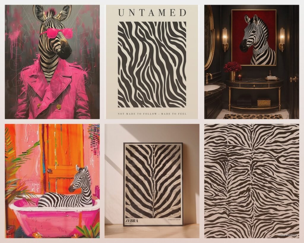
Oh and another thing, the gallery wall approach with zebra print is tricky because the pattern is already so busy. What I do is mix different crops and angles. Like one close-up of just the stripes, another showing the full zebra profile, maybe a third that’s like an abstract stripe pattern. Keeps it interesting without being overwhelming. I saw someone on Instagram do five identical zebra portraits in a row and my eyes literally didn’t know where to look.
For framing – black frames are the obvious choice and they totally work, don’t get me wrong. But I’ve been experimenting with natural wood frames lately and there’s something about the warmth of oak or walnut against those stark stripes that feels really sophisticated. Makes it less “I decorated my apartment in 2005” if you know what I mean. White frames can work too but they need the right space, like if your walls are a soft gray or you’ve got a really minimalist Scandinavian thing going on.
The canvas vs framed print debate is real. Canvas prints (the gallery-wrapped kind where the image continues around the sides) are great for a more casual modern look. No glare issues which is HUGE if you’re hanging it opposite a window. But personally I think zebra print looks more elevated behind glass in a proper frame. It contains all that visual chaos a bit, gives it boundaries. My cat knocked over a canvas zebra print once and it got a corner dent that I could never fully fix, so there’s that durability factor too.
Wait I forgot to mention – think about the stripe direction. Horizontal stripes can make a wall feel wider, vertical stripes draw the eye up and make ceilings feel higher. Most zebra prints are gonna have stripes going in multiple directions because that’s how zebras work, but you can choose prints where one direction dominates. I used a mostly-vertical stripe zebra print in a narrow hallway and it actually helped make the space feel less cramped.
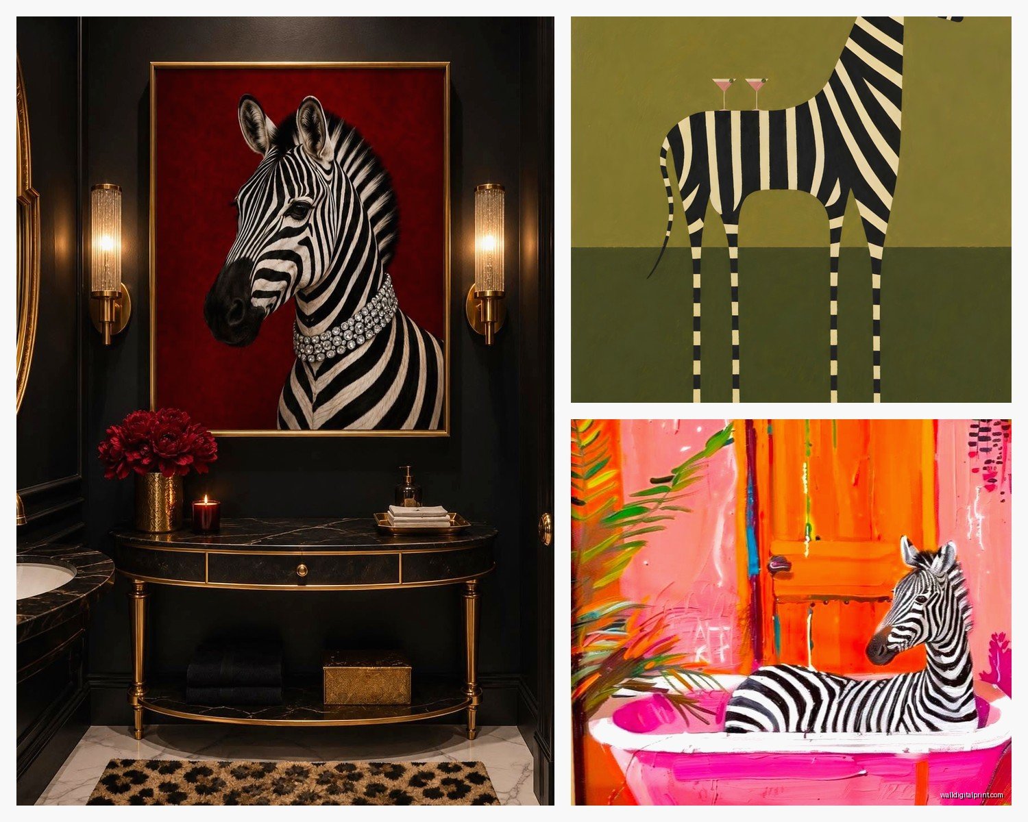
Placement is where people mess up constantly. Don’t just slap it on any empty wall. Zebra print demands to be a focal point, so put it somewhere your eye naturally goes when you enter the room. Above a sofa is classic for a reason. Over a console table in an entryway makes a statement. Behind a bed as a headboard situation – I’ve done this and it looks incredible but fair warning, it’s A LOT of pattern to wake up to. My partner was not a fan.
If you’re renting or just commitment-phobic, removable wallpaper in a zebra stripe pattern is actually genius. I used the Tempaper brand in a client’s powder room and it went up so easily. You get the full impact without having to deal with framing and hanging. Plus you can take it with you when you move. The pattern repeat on wallpaper does matter though – make sure the stripes align properly or it’ll look janky.
This is gonna sound weird but lighting makes or breaks zebra print wall art. I installed picture lights above a large zebra print in my living room and the difference is dramatic. The shadows and highlights in the stripes become way more dimensional. Track lighting works too. Just avoid putting it in a spot where light reflects directly off the glass – been there, learned that lesson the hard way.
Color-wise, most zebra prints are straight black and white which is the safest bet. But I’ve seen some really cool versions with subtle toning – like sepia or slightly warm blacks, or even navy blue instead of pure black. These can be easier to work with if your space has a lot of competing elements. There’s this artist on Minted who does zebra prints with the faintest blush pink background and it’s surprisingly wearable.
Okay so funny story – I bought what I thought was a high-quality print from Amazon and when it arrived the blacks were more like dark gray and the whites were cream-ish. Total waste. Now I only buy from places that show actual customer photos or have really clear specs about paper quality and ink type. Giclée prints are worth the extra money if you want something that’ll last and not fade. The cheap posters start looking washed out after like six months, especially if they get any sun exposure.
If you’re going the DIY route and printing your own, you gotta use the right paper. I experimented with this when my client’s budget was tight. Matte photo paper at 250gsm or higher is ideal – it looks expensive and doesn’t show fingerprints. Glossy can work but it’s very reflective. I printed a 24×36 at a local print shop for like $40 and it honestly looked as good as the $200 framed version I’d been eyeing.
Multiple zebras vs single zebra is another decision point. A herd scene can feel more dynamic and alive, good for bigger spaces or if you want an adventurous vibe. A single zebra portrait is more intimate and elegant, works better in smaller rooms or sophisticated spaces. I have a single zebra face print in my bedroom that’s so calming somehow, even though it’s a wild animal staring at me while I sleep.
Don’t forget about the rest of your room when you’re planning this. Zebra print is bold enough that it becomes part of your color scheme even though it’s technically neutral. I always tell people to pull back on other patterns when they’re adding zebra art. Like maybe your throw pillows stay solid, your rug is subtle. Let the zebra print be the star. I’ve seen rooms where there’s zebra art PLUS leopard print pillows PLUS a geometric rug and it’s just sensory overload.
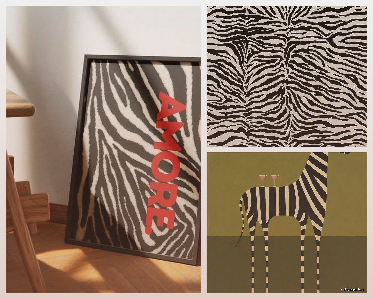
The abstract zebra stripe prints – where it’s just the pattern without the actual animal – these are super versatile. They read almost like a graphic design element rather than animal decor. I used one in a modern office space and nobody even realized it was zebra-inspired at first. They just saw cool black and white stripes. This style works if you want the visual impact without the literal safari theme.
Matting makes a bigger difference than you’d expect. A white mat around a zebra print gives it breathing room and makes it feel more gallery-like. Black mat is dramatic and modern. No mat at all – just print to edge of frame – feels more contemporary and casual. I usually do at least a 2-inch mat for anything smaller than 16×20, and go wider for bigger pieces.
For kids’ rooms, zebra print is actually perfect because it’s gender-neutral and grows with them. Not too babyish, not too mature. I did a nursery with soft zebra illustrations (less photorealistic, more storybook style) and it was adorable without being cutesy. Just avoid anything too intense or the stripes might be overstimulating at bedtime – learned that from a very tired parent client.
Oh wait, there are also metallic zebra prints now – like with gold or silver accents on the stripes. These can look really luxe in the right setting but they’re tricky. Very glam, very specific aesthetic. I saw one at HomeGoods that had rose gold details and I was tempted but I knew I’d get tired of it quickly. Stick with classic black and white unless you’re absolutely sure about your style direction.
The thing nobody tells you is that zebra print shows dust and smudges like crazy, especially on glass. Keep a microfiber cloth handy. Also if you’ve got it in a bathroom or kitchen, the humidity can warp cheaper frames over time, so invest in better quality for those spaces or skip glass altogether and do canvas.
Mixing zebra print with other animal prints is possible but requires a careful hand. I’ve successfully combined zebra with cowhide rugs – both have that black and white thing going on so they harmonize. Mixing with leopard or cheetah print is harder, needs to be done in small doses or different areas of the room. Generally I’d say pick one animal print to dominate and let others be minor accents at most.
If you’re buying online, really zoom into the product photos to check the stripe quality. Some cheaper prints have stripes that look almost digitally blurred or pixelated. The stripes should have clean edges and good contrast. Read reviews specifically mentioning print quality, not just shipping speed.
Seasonal switching is something I do sometimes – I’ll rotate my zebra print out for summer and bring in something lighter, then put it back in fall. It’s got that cozy dramatic thing that works well in cooler months. Not necessary obviously, but if you get bored easily like I do, having a few pieces to rotate keeps things fresh.
Okay I think that’s everything swimming around in my brain about zebra print right now. It’s really not as intimidating as people think once you just commit to it and find the right piece for your space. Start with one print, live with it for a bit, see how you feel. You can always add more or move it around until it clicks.