Wall Art Guide, Wall Art Tutoriels
Artdesigna Glass Wall Art: Brand Transparent Design Collection
Aug
So I’ve been working with Artdesigna’s glass wall art for like three client projects now and honestly? It’s one of those things where I wish someone had just told me the real deal upfront instead of me figuring it out through trial and error.
What Makes This Collection Actually Different
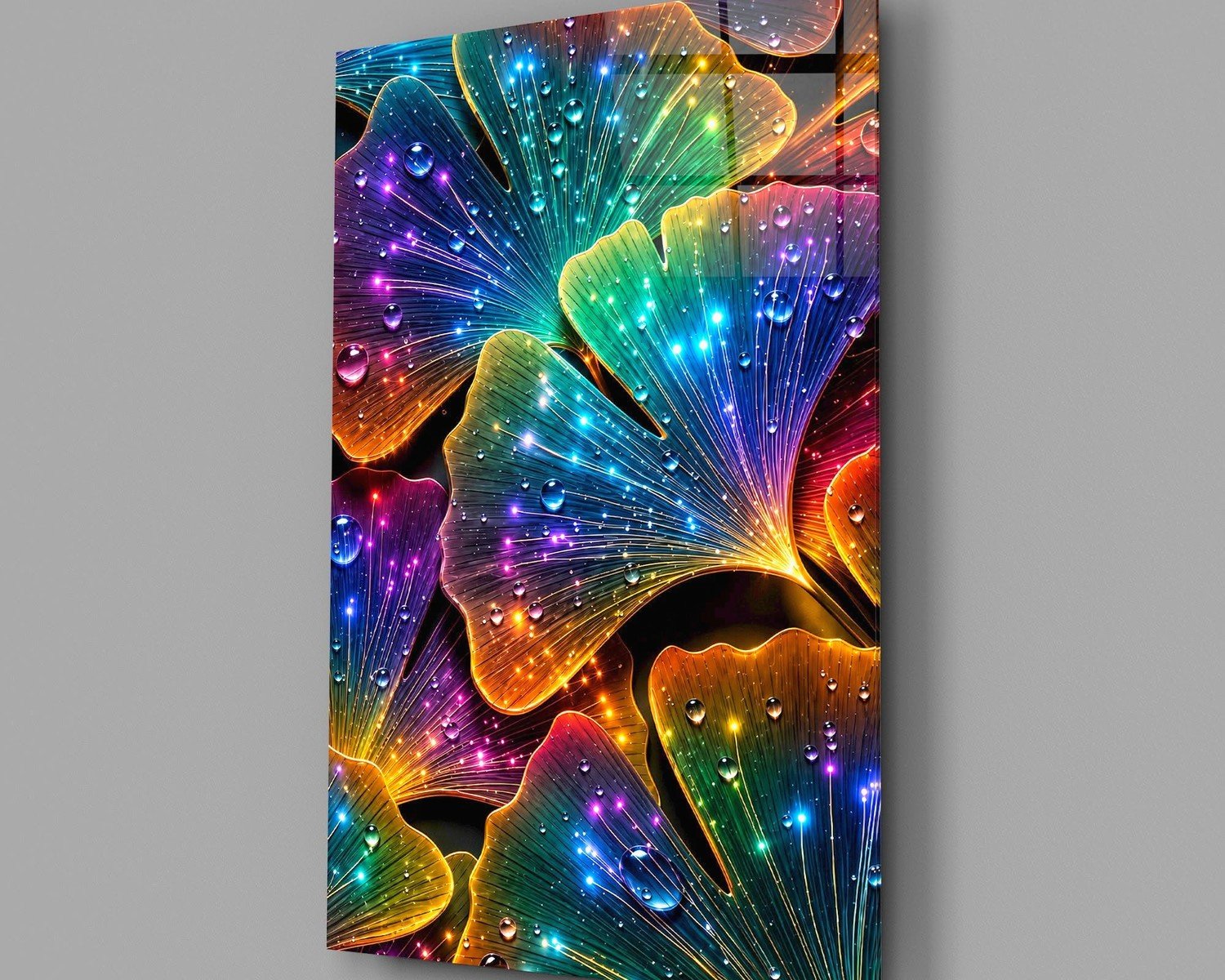
Okay so the Transparent Design Collection is basically their premium line of tempered glass panels with UV-printed designs. The transparent thing isn’t marketing BS – these pieces actually let light pass through while still showing the design, which is pretty cool if you position them right. I tested this in my own apartment first because I wasn’t gonna recommend something to clients without seeing it myself.
The glass is 6mm thick tempered safety glass, which means if it somehow breaks it shatters into tiny pieces instead of dangerous shards. Had a client’s kid throw a toy at one once and… yeah, you want tempered. The mounting system uses these chrome standoffs that keep the glass about 15mm off the wall, creating this floating effect that photographs really well.
Picking the Right Size Without Screwing It Up
They come in like five standard sizes and this is where people mess up constantly. The smallest is 40x60cm which honestly looks kinda sad unless you’re doing a gallery wall situation. The 60x80cm is their sweet spot for most rooms – big enough to make a statement but not so massive that it overwhelms.
Here’s what I learned the hard way: measure your wall space but then subtract at least 30cm on each side for visual breathing room. I once ordered an 80x120cm piece for a client’s dining room and when it arrived we realized it was technically the right size but visually it looked crammed. We had to move it to a different wall entirely.
The 100x150cm pieces are gorgeous but they need serious wall real estate. Think large living rooms, spacious hallways, or behind a king bed. My smallest client space was maybe 3.5 meters wide and even the medium size felt tight.
The Viewing Distance Thing Nobody Talks About
Stand where you’ll actually see the piece most often and measure that distance. If it’s less than 2 meters away, the smaller sizes work fine. But if you’re mounting it across from a sofa where you’ll be like 4 meters away, you need to go bigger or the design details get lost. I have one in my office and I sit about 2.5 meters from it – the 60x80cm size is perfect there.
Design Selection Strategy
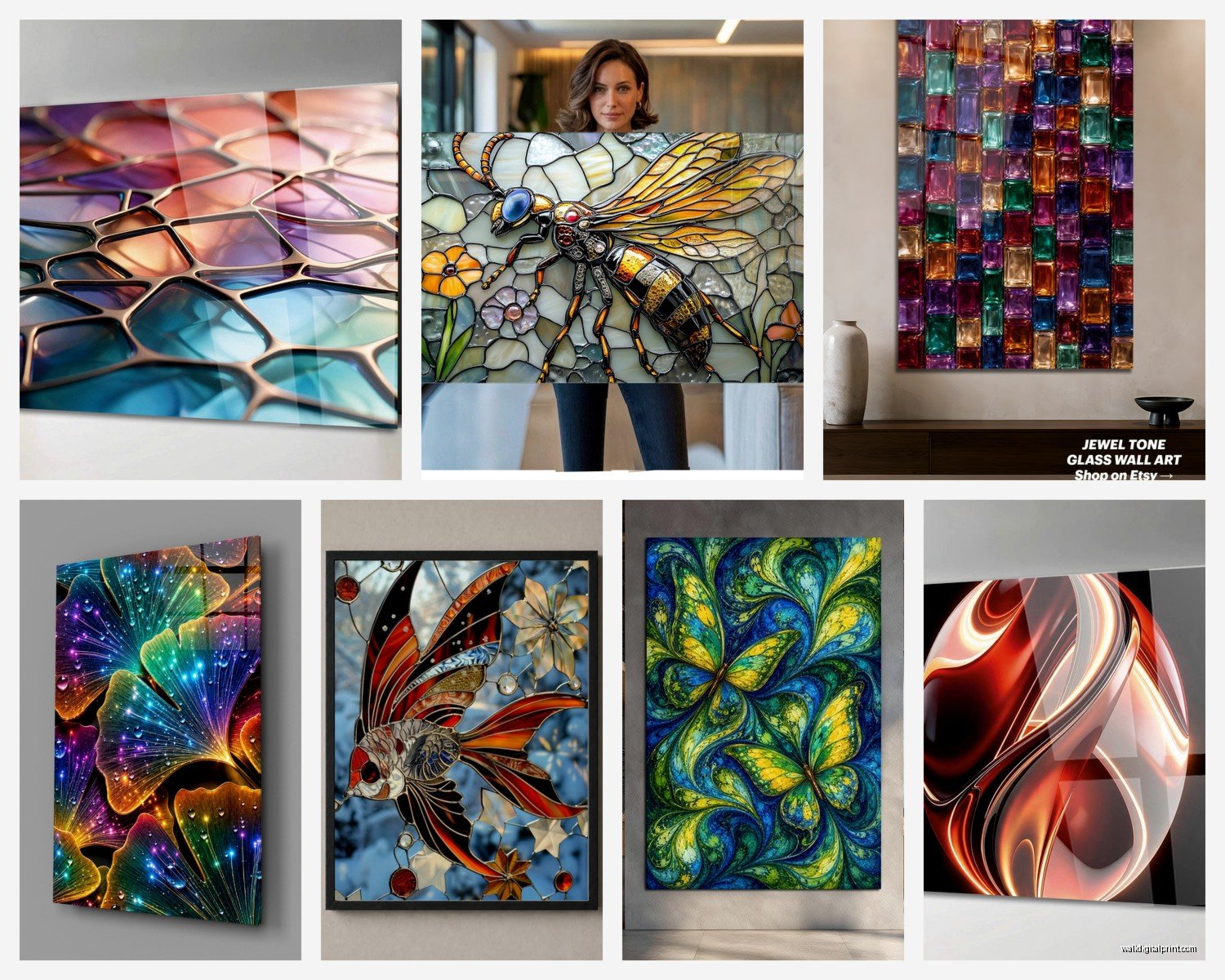
The collection has maybe 40-50 designs last time I counted, split between abstract, botanical, geometric, and what they call “artistic photography.” The transparent ones are tricky because the wall color behind them affects how they look.
Light walls make the colors pop more vibrantly. Dark walls create this moody, layered effect where the transparency becomes more subtle. I’ve got a charcoal gray wall in my bedroom and the botanical piece there looks completely different than the same design would on white.
Test this before committing: they have this thing on their website where you can download low-res versions of the designs. Print them out or display them on a tablet against your actual wall color. Sounds excessive but I’ve avoided multiple returns this way.
The Abstract vs Representational Decision
Abstract designs are more forgiving with furniture and decor changes. You swap out your throw pillows or get a new rug and the abstract piece still works. The botanical and photographic ones are stunning but they’re pickier about their surroundings.
I used one of their geometric transparent pieces in a client’s office renovation and three years later after they’ve changed literally everything else in the room, the art still fits. Meanwhile another client got this beautiful transparent floral design and when they redecorated six months later it clashed with their new color scheme.
Installation Real Talk
The mounting hardware comes with the piece which is nice. You get four chrome standoffs, wall plugs, and screws. What you actually need though: a drill, the right drill bit for your wall type, a level, a pencil, and honestly a second person unless you’re mounting the smaller sizes.
The instructions are decent but here’s what they don’t emphasize enough – finding studs is ideal but not always necessary with the wall plugs they provide. I’ve mounted these on drywall, plaster, concrete, and brick. The drywall ones need either studs or heavy-duty anchors if you’re doing the larger sizes.
Spacing the Mounting Points
Each piece has four mounting holes, one in each corner. Mark all four spots before drilling anything. Use the level for both horizontal and vertical alignment because if this is off even slightly it’s super noticeable with the transparent effect. The floating mount system makes any tilt really obvious.
My process: mark the top two holes first, use the level, then measure down for the bottom holes. Double-check the diagonal measurements are equal – this catches any weird skewing. I messed this up on my first install and had to fill and repaint the holes, so yeah, measure twice and all that.
Oh and another thing – if you’re mounting on tile like in a bathroom or kitchen backsplash, you need a special glass/tile drill bit and you gotta go slow. Cracked a tile once by rushing it and that was a whole thing.
Lighting Considerations That Actually Matter
The transparent aspect means lighting is huge. Natural light during the day creates one effect, artificial light at night creates another. I’ve got a client who positioned theirs opposite a window and during golden hour the light passes through and projects colors onto the adjacent wall – totally accidental but looks amazing.
For artificial lighting, avoid putting them where light hits directly from the front. It creates glare and washes out the design. Side lighting or ambient room lighting works better. Track lighting aimed at the wall behind the piece creates this backlit effect that’s pretty dramatic.
Rooms Where They Work Best
Living rooms are obvious and they work great there. Dining rooms too, especially on the wall you face while eating. I’ve done three bedroom installations – one behind a bed, two on feature walls opposite the bed. Bathrooms can work but only if there’s good ventilation because the glass shows water spots.
Home offices are actually my favorite application. The transparency keeps the space feeling open while adding visual interest. And conference rooms in office spaces – these make corporate environments feel less corporate without being too casual.
Wait I forgot to mention – avoid placing them in direct sunlight for extended periods. The UV printing is pretty stable but prolonged sun exposure can fade colors over time. I’ve got one that gets afternoon sun for like an hour daily and after two years it’s fine, but all-day direct sun might be risky.
Cleaning and Maintenance
Glass cleaner and a microfiber cloth, that’s it. Spray the cloth not the glass directly so cleaner doesn’t drip behind the standoffs. Clean every couple weeks or whenever you notice dust or fingerprints.
The standoff mounting means you can’t clean behind the glass easily without unmounting it, so just… don’t touch the back surface during installation. Wear clean gloves if you’re worried about leaving prints.
Some designs show dust more than others – the darker transparent designs hide it better than the lighter ones. My light blue abstract piece needs cleaning more often than my client’s deep purple geometric one.
Pricing Reality Check
These aren’t cheap but they’re not insanely expensive either. The smallest sizes start around $150-200, medium sizes hit $300-400, and the large ones can go $600-800 depending on the design complexity. Custom sizes cost more obviously.
Compare that to framed art prints behind glass and the pricing is actually competitive, plus you get the unique transparent effect and the modern mounting system. I’ve seen similar glass art at galleries priced way higher, so Artdesigna’s positioned in that accessible premium range.
They do sales occasionally – I’ve caught 20-25% off a few times. Sign up for their newsletter if you’re not in a rush, wait for a promotion. My cat knocked over my coffee while I was typing this, hang on.
Common Mistakes People Make
Ordering too small is number one. Everyone thinks they want smaller than they actually need. The pieces look bigger on the website than on your wall.
Not considering wall color is second. The transparent designs especially need wall color consideration. White walls are safest if you’re unsure.
Mounting too high is third. Art should generally be at eye level, which is about 145-150cm from the floor to the center of the piece. People mount stuff too high constantly and then wonder why their room feels off.
Mixing too many styles – if you’re doing multiple pieces, keep the style consistent. All abstract, all botanical, whatever. I had a client mix geometric with photographic transparent pieces and it looked scattered rather than curated.
The Gallery Wall Approach
Speaking of multiple pieces, the smaller sizes work great in gallery wall arrangements. Get three or four of the 40x60cm pieces in coordinating designs from the transparent collection. Space them about 5-8cm apart in whatever layout suits your space.
I did this in a narrow hallway where one large piece would’ve been overwhelming. Four small transparent pieces in complementary colors created movement and interest without closing in the space. The transparency kept it feeling open which was crucial in that tight area.
Matching With Your Existing Decor
Pull colors from your existing space into the art selection. If you’ve got blue accents, choose designs with blue elements. Sounds basic but it works. The transparent nature means you’ll see your wall color mixed with the design colors, so factor that in.
Minimalist spaces can handle bolder, more complex designs. Busier rooms need simpler, more abstract transparent pieces. My living room has a lot happening furniture-wise so I went with a simple two-color geometric design and it balances everything out.
Metal finishes matter too – the chrome standoffs work with most modern/contemporary spaces. If you’ve got warmer metals like brass or copper in your space, you might want to switch out the standoffs. Artdesigna sells brass finish ones separately which I’ve used for clients with warmer-toned spaces.
Return Policy and Customer Service Notes
They have a 30-day return window which is standard. Glass arrives packaged really well – foam corners, bubble wrap, sturdy box. I’ve ordered maybe eight pieces total and never had shipping damage.
Customer service is pretty responsive via email. Response time is usually within 24 hours on weekdays. I had a question about custom sizing once and they got back to me same day with detailed info and pricing.
One thing that’s kinda annoying – they don’t do partial refunds for minor imperfections. It’s either full return or keep it. Had a client receive one with a tiny printing flaw on the edge, barely noticeable, but they wanted a partial discount and Artdesigna said no. They did offer free replacement though, which is fair I guess.
Best Designs From the Transparent Collection
Totally subjective but I’ll share what I’ve had success with. The “Flowing Lines” abstract in blue and silver tones works in like 80% of modern spaces. It’s interesting without being demanding.
“Botanical Shadows” is this transparent design with leaf silhouettes that creates really nice layered effects. Looks good in bedrooms and bathrooms where you want something natural but not literal.
For offices and professional spaces, “Geometric Waves” in gray and white is sophisticated without being boring. The transparency keeps it from feeling too corporate.
There’s this one called “Light Refraction” that’s all about intersecting transparent color planes – it’s gorgeous but needs the right space. Works best in rooms with a lot of natural light and minimal decor. Too busy otherwise.
Okay so funny story, I almost ordered “Crystal Burst” for my own place and then saw it at like three different clients’ houses in the same month, so I went with something else just to avoid that weird feeling of seeing your own art everywhere.
When This Isn’t the Right Choice
Traditional or classic interiors – these pieces are contemporary/modern in style and they’ll clash with traditional furniture and decor. If you’ve got ornate frames and classical furniture, look elsewhere.
Super tight budgets – there are cheaper wall art options if money is really tight. These are worth it for the quality and unique transparent effect, but stretched canvas prints or paper prints in frames cost less.
Rental restrictions – some rentals don’t allow wall drilling. The standoff system requires drilling four holes per piece, so if that’s not allowed you’re outta luck. There’s no alternative mounting method that I know of.
Textured walls can be problematic. The standoffs need to sit flush against the wall, so heavily textured surfaces might not work well. Smooth or lightly textured walls only.
Alright I think that covers most of what you’d actually need to know before buying. The transparent collection is genuinely cool if it fits your style and space, just gotta think through the practical stuff first instead of impulse buying because something looks pretty online.