Wall Art Guide, Wall Art Tutoriels
Alphabet Wall Art: ABC Learning Educational Kids Decor
Jul
So I’ve been setting up alphabet wall art in kids’ rooms for like three years now and honestly it’s one of those things that seems super simple until you’re actually standing there with a measuring tape wondering why the letters look crooked.
The Different Types You’ll Actually Find
Okay so there’s basically four main categories and they all work differently. You’ve got your wooden letters that you mount individually, the canvas prints with the whole alphabet on one piece, the fabric banners that hang, and then these foam or felt stick-on situations.
The wooden letters are what everyone thinks they want at first. They look amazing on Pinterest and in boutique nurseries but here’s what nobody tells you—mounting 26 individual letters takes FOREVER. I did this in my nephew’s room last year and my sister was watching some true crime documentary while I was up on the ladder for like two hours. You need a level, you need to mark each spot, and if you’re doing it over a crib or changing table you gotta make sure they’re secured really well because toddlers are basically tiny destructive forces.
Wooden Letter Reality Check
The best wooden ones I’ve found are the ones that come with a template. Some brands include this paper guide where you can tape it to the wall and it shows you exactly where each nail goes. Game changer. Without that you’re basically eyeballing everything and it never looks as straight as you think it does.
Price-wise they range from like $3 per letter at craft stores (which you’ll need to paint yourself) up to $15-20 for the fancy painted or patterned ones. So you’re looking at anywhere from $80 to like $500 for a full alphabet depending on how extra you wanna go.
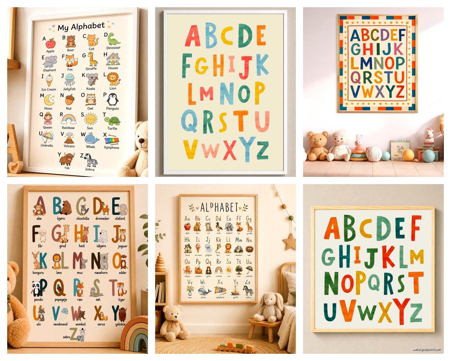
Canvas Prints Are Your Friend If You’re Lazy
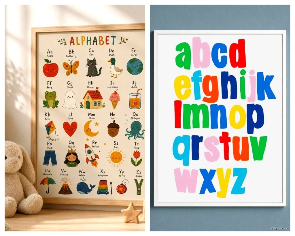
Not gonna lie, this is what I recommend to most people now. One piece, one nail, done. You can find them on Etsy or Amazon and they come in literally every style. Watercolor animals with letters, minimalist black and white, safari themes, woodland creatures, space themes with planets for each letter.
I just installed one last month that had each letter paired with a corresponding animal and the mom was worried it would be too busy but honestly it works because kids need that visual association anyway. A is for Alligator makes more sense to a three-year-old than just the letter A floating there.
The sizing is important though. For a standard kids room I usually go with 16×20 or 18×24. Anything smaller and you can’t really see it from across the room which defeats the educational purpose. I made that mistake once with an 11×14 and it just looked like a random decoration instead of something functional.
What to Look for in Canvas Prints
Make sure it’s actual canvas and not just poster paper. The canvas ones are sturdier and if they get that weird sun fade thing happening it’s less noticeable. Also check if it comes with the frame or if you need to buy separately because that’s annoying to figure out later.
Oh and another thing—read the reviews about color accuracy. I ordered this gorgeous pastel rainbow alphabet once and when it arrived it was SO much more neon than the listing photos. Looked like a rave instead of a nursery. Had to return it which was a whole thing.
Fabric Banners and Hanging Options
These are perfect if you’re renting or don’t want to put holes in the wall. They usually come as a long banner with all the letters in order or sometimes as individual pennant flags you string together.
I love these for playrooms more than bedrooms because they have this fun casual vibe. They’re also great because when the kid outgrows the alphabet thing you can just take it down without having to patch nail holes or deal with paint touch-ups.
The downside is they can look wrinkled or saggy if you don’t hang them properly. You need to keep the string or ribbon taut and I usually use those 3M command hooks on either end. My cat knocked one down once by jumping at it so if you have pets maybe mount it higher than you think you need to.
Material Matters
Felt banners are the most durable and they don’t wrinkle as much. Canvas or burlap ones look more “designed” but they need to be ironed sometimes which is just… no thanks. There are also vinyl ones but those can look kinda cheap in person even though they photograph well.
The Stick-On Situation
Wait I forgot to mention the peel and stick options. These are foam letters or vinyl decals that you just stick directly on the wall. Super popular right now and I get why—no tools needed, no measuring really, and kids can sometimes help place them which makes it like an activity.
But here’s the thing. The quality varies SO much. I’ve used some that peeled off within a month and others that have been up for two years and still look perfect. The trick is to make sure your wall is actually clean before you apply them. Like really clean. I use rubbing alcohol on a cloth and wipe down the whole area first.
Application Tips Nobody Tells You
Start from the middle of your wall and work outward. If you start in a corner you’ll run out of space weird and the letters will get all cramped at the end. Also use a pencil to lightly mark where you want the baseline to be so they’re all relatively level. You can erase it later.
Some people do them in a grid pattern which looks really organized and educational. Others do a more scattered organic placement which is cuter for younger kids. I did the scattered thing in a two-year-old’s room and the mom loved it but then when the kid turned four she wanted them in order so we had to redo the whole thing. Just something to think about.
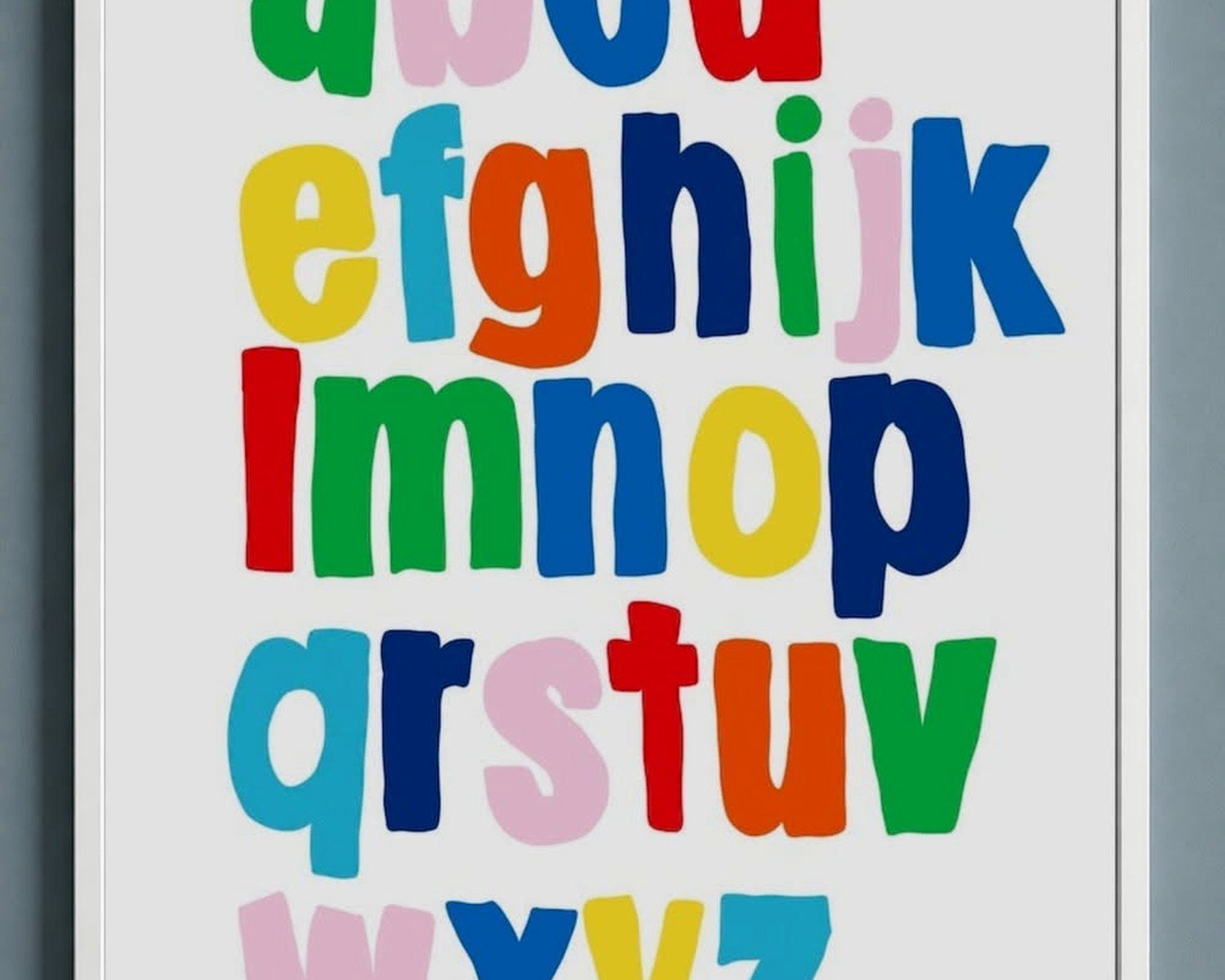
Color Schemes That Actually Work
Everyone wants to match their existing decor which makes sense but here’s what I’ve learned—if the alphabet wall art is gonna be educational and not just decorative, it needs to have some contrast. All pastel everything looks beautiful but a three-year-old learning letters needs to be able to actually see and distinguish them clearly.
The combinations that work best are usually a neutral background with bold letter colors or vice versa. Navy letters on white, rainbow letters on gray, black letters on cream. That kind of thing.
This is gonna sound weird but I actually don’t love when people try to match it TOO perfectly to every other element in the room. If your bedding is elephants and your curtains have elephants and your rug has elephants and THEN your alphabet also has elephants it’s just… a lot of elephants. Sometimes the alphabet art should be its own thing.
Where to Actually Put It
The obvious spot is above the crib or toddler bed but that’s not always the best choice. If it’s purely decorative sure, but if you want the kid to actually interact with it and learn from it, lower is better.
I’ve done a lot of installations on the wall next to the changing table where the kid is lying there anyway and might as well be looking at letters. Or on the wall in a reading nook area at the kid’s eye level when they’re sitting.
One client had me put it in the hallway right outside the kid’s room and I thought that was weird at first but it actually worked great because the kid passed it multiple times a day going to the bathroom or whatever.
Height Guidelines
For babies under one year, anywhere is fine because they’re not really interacting with it yet. For toddlers age 2-4, I usually center it around 36-40 inches from the floor. For kids 5 and up who are actively learning to read and write, even lower—maybe 30-36 inches so they can touch and trace the letters if they want.
Mixing Educational with Aesthetic
The best alphabet wall art pulls double duty. It teaches but it also looks good because you’re gonna be staring at it for years potentially.
I’m currently obsessed with the ones that incorporate nature elements. Like each letter is formed by flowers or leaves or woodland items. The kids learn the letter shapes but it doesn’t scream EDUCATIONAL MATERIAL in that primary colors classroom poster way.
There are also these modern geometric ones where each letter is a different minimalist design. Very Scandinavian. Very Instagram-friendly. But still functional for learning.
Oh and the vintage-style alphabet charts that look like old school classroom posters? Those are having a moment and I actually love them for a more eclectic or maximalist room design. They work in spaces where the super cutesy stuff would feel out of place.
Multilingual Options
If you’re raising bilingual kids there are alphabets available in Spanish, French, Mandarin, Hebrew, basically any language. Some even show the same letter in multiple languages side by side which is cool. I did one recently with English and Korean and the family loved having both represented in the room.
The DIY Route
Okay so funny story, I tried to make my own alphabet wall art once because I had this specific vision and couldn’t find it anywhere. Bought wooden letters from the craft store, painted them, added little animals I printed and decoupaged… it took me like six weekends and honestly it looked fine but not $400 worth of my time fine, you know?
If you’re crafty and have the time go for it. There are tons of tutorials. But factor in the actual cost of materials because it adds up faster than you think. By the time I bought the letters, paint, brushes, Mod Podge, printed images, and the mounting supplies I was at like $120 and could’ve just bought something finished for that.
The one DIY I DO recommend is printing alphabet cards or pages and framing them yourself. You can find free printables or buy them on Etsy for cheap, then just get simple frames from Target or IKEA. Gives you the custom look without the custom price.
What Age Range Actually Uses This
Most alphabet wall art is marketed for babies through age 5 or 6. In reality babies don’t care about it at all, it’s purely for parent aesthetic purposes until the kid is maybe 18 months.
The sweet spot is ages 2-4 when they’re actively learning letters and sounds. After kindergarten starts most kids don’t need it on the wall anymore because they’re reading.
That said I’ve seen some families keep it up longer for sentimental reasons or because it still fits the room design. And if you have multiple kids you’ll get more years out of it obviously.
Maintenance and Longevity
Wooden letters collect dust like crazy. You gotta dust them individually which is annoying. Canvas prints are easier, just wipe with a slightly damp cloth every once in a while.
The stick-on ones can start to peel at the edges over time especially in humid climates or if they’re near a window with direct sun. I’ve had to reinforce a few with extra adhesive.
Fabric banners can fade if they’re in direct sunlight. I learned this the hard way with a really expensive hand-sewn one that got completely bleached out on one side after like eight months.
If you’re picking something for longevity go with canvas or high-quality vinyl decals. If you like changing things up frequently the removable options make more sense even if they don’t last as long.
Just measure your space first, think about whether you want this to be functional or decorative, and don’t stress too much about making it perfect because kids honestly don’t notice if the letters are slightly crooked.