Wall Art Guide, Wall Art Tutoriels
Rick and Morty Wall Art: Animated Sci-Fi Show Decor
Jul
So I’ve been helping people deck out their spaces with Rick and Morty stuff for a while now, and honestly it’s one of those things where you can go really wrong or really right depending on what you pick and where you put it.
Start With Your Wall Color Situation
Okay so first thing – and I learned this the hard way after hanging a gorgeous portal print on my friend’s dark gray wall where you literally couldn’t see it – you gotta think about your actual wall color. Rick and Morty art comes in such a massive range of styles, from those super bright neon portal scenes to darker, moodier character studies. If you’ve got white or light walls, you can basically do whatever. But darker walls? You need something with serious color contrast or it just disappears into the background.
I had this client last month with navy bedroom walls who was dead set on this black-and-white sketch style poster of Rick in his lab, and I had to be like… we need to reframe this conversation because it’s gonna look like a dark blob from more than three feet away.
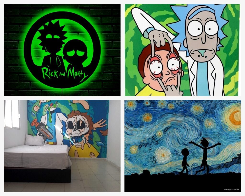
The Different Art Styles You’ll Actually Find
There’s basically five main categories of Rick and Morty wall art out there, and they give off completely different vibes:
- Official screen prints and promotional posters – clean, bright, exactly what you see on the show
- Fan art interpretations – these range from watercolor soft stuff to hyper-detailed realistic versions
- Minimalist geometric designs – think abstract portals, simplified character silhouettes
- Quote-based typography art – catchphrases on colored backgrounds
- Mashup art – Rick and Morty crossed with other pop culture stuff
The official stuff is safe but kinda boring if I’m being honest. Like yes, it looks exactly like the show, but that’s also the problem? It can read very “dorm room” real fast. The fan art interpretations are where things get interesting because you can find pieces that actually look like legitimate art while still being recognizable as the characters.
Size Actually Matters More Than You Think
This is gonna sound weird but the biggest mistake I see is people buying art that’s too small for their wall. A single 8×10 print on a big empty wall just looks… sad and unfinished. You want at least 16×20 for a focal point piece, or if you’re doing smaller prints, you need to do a gallery wall situation with at least 4-6 pieces.
I’ve got a 24×36 canvas of the portal scene in my studio and it’s literally perfect – big enough to make a statement but not so overwhelming that it takes over the whole room. My cat keeps sitting in front of it during video calls though which is… not ideal.
Framing Changes Everything
Oh and another thing – framing quality makes or breaks these pieces. I cannot stress this enough. A cheap poster in a nice frame looks way better than expensive art in a garbage frame. For Rick and Morty specifically, I usually go with:
- Black frames for darker, moodier pieces or anything with a lot of black in the design
- White or light wood frames for the brighter, more colorful portal scenes
- Metal frames for the minimalist geometric stuff – it gives it a more contemporary gallery feel
Floating frames are really cool for canvas prints because they give this depth effect that works great with the sci-fi portal imagery. But they’re pricier, so like… budget accordingly.
Where to Actually Put This Stuff
Okay so placement. Your living room can handle Rick and Morty art if – and this is important – you style it right. Don’t just slap a poster on the wall and call it a day. I did a whole living room last year where we used a really sophisticated geometric portal design as the main piece above the sofa, kept it in a gallery-quality frame, and surrounded it with other abstract art pieces. Nobody walking in was like “oh this is a cartoon room” because the styling was intentional.
Home offices and studios are honestly the sweet spot for this stuff. You can be more playful, and if you’re on video calls, having something interesting in the background is actually good. Just maybe avoid the super explicit quote prints for work calls… learned that one from a client who had “WUBBA LUBBA DUB DUB” in huge letters behind their head during a presentation.
Bedrooms are totally fair game, obviously. Guest rooms too. I actually think a really cool Rick and Morty piece in a guest room is a conversation starter and shows personality.
Kitchens and dining rooms… this gets tricky. The super colorful stuff can work if your kitchen has a modern vibe, but traditional or farmhouse kitchens? Probably skip it.
The Gallery Wall Approach
Wait I forgot to mention – gallery walls are your best friend with this theme because you can mix official art with fan interpretations with some of the funnier quote pieces without it looking chaotic. The key is keeping a consistent frame color and spacing them evenly.
I usually do a 2-inch gap between frames, and I always lay everything out on the floor first before putting holes in the wall. Use painter’s tape to mark the corners on the wall once you’ve got your layout figured out. Saves so much headache.
For a Rick and Morty gallery wall, I like mixing:
- One large focal piece (biggest one, usually 16×20 or larger)
- 3-4 medium pieces around it
- 2-3 smaller accent pieces to fill gaps
The focal piece should be the most “artistic” one – like a really cool portal scene or a sophisticated character study. Then you can get more playful with the smaller pieces.
Color Coordination Without Looking Like You Tried Too Hard
The show’s color palette is actually pretty specific – lots of teals, greens, yellows, and that signature portal green. If you’re trying to make this look intentional and not just “I like cartoons,” pull those colors into other parts of the room.
Throw pillows in teal or green, a yellow accent chair, stuff like that. It creates this cohesive thing where the art feels like part of the design instead of just stuck on the wall. My client with the navy walls? We ended up doing a teal velvet headboard and some green plants, then used a really vibrant portal print, and it actually looked sophisticated.
Mixing With Other Art
You can totally mix Rick and Morty art with other stuff, but you gotta be smart about it. Abstract art works great with the geometric Rick and Morty pieces. Space-themed art obviously fits the sci-fi vibe. Even some botanical prints can work if you’re going for that mad scientist laboratory feel with the Rick pieces.
What doesn’t work? Trying to mix it with super traditional landscapes or classical art. The tonal clash is just… no.
Quality Check Before You Buy
Okay so funny story – I ordered what I thought was a canvas print last year and it turned out to be a poster printed on paper-thin canvas material that was basically see-through. Waste of money. Here’s what to actually look for:
For Canvas Prints:
- Minimum 400gsm canvas weight
- Gallery wrapped edges (the image wraps around the sides)
- Actual wooden frame underneath, not cardboard
- UV protective coating so it doesn’t fade
For Posters:
- At least 200gsm paper weight
- Matte finish usually looks better than glossy for this kind of art
- Archival quality if you actually care about it lasting
The cheap stuff on certain websites might look fine in photos but shows up looking washed out or pixelated. If it’s suspiciously cheap, there’s probably a reason.
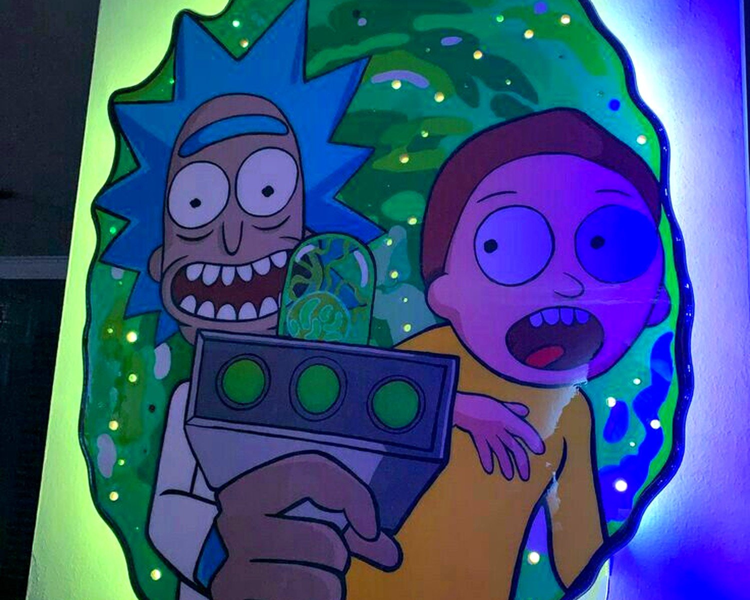
The Neon Sign Situation
Oh and another thing I’ve been seeing lately – LED neon signs with Rick and Morty designs. These are either amazing or terrible depending on how you use them. A portal neon sign in a home bar or game room? Actually pretty cool. In your bedroom? Maybe too bright unless you put it on a dimmer.
I helped someone install one of those “Get Schwifty” neon signs in their basement entertainment area and it genuinely looks great, but we put it on a smart plug so they can control the brightness. Full brightness all the time is like… a lot.
Budget Breakdown Real Talk
If you’re trying to do this without spending a fortune:
Small budget (under $100): Get 2-3 quality prints, frame them yourself with decent frames from a craft store, do a simple arrangement on one wall.
Medium budget ($100-300): Mix of canvas prints and framed art, maybe one larger statement piece, better quality frames, could do a small gallery wall.
Larger budget ($300+): Multiple canvas pieces, professional framing, maybe a custom commissioned piece, neon sign if you want, whole gallery wall situation.
The medium budget range is honestly the sweet spot where you can make it look really good without going overboard.
Custom and Commissioned Pieces
This is gonna sound extra but if you really want something unique, commissioning an artist to do a custom Rick and Morty piece in a specific style can be worth it. I had a client who commissioned this gorgeous watercolor of Rick and Morty that looked like actual fine art, not fan art. Cost like $400 but it’s the centerpiece of their whole office.
Etsy has tons of artists who do custom work, just make sure you check their reviews and previous work before ordering.
Lighting Your Art Properly
Wait I forgot to mention lighting because this actually makes a huge difference. Those bright portal scenes and neon colors really pop when they’re properly lit. Picture lights mounted above the frame work great, or if you’ve got track lighting, angle one of the spots at your main piece.
For gallery walls, I usually recommend soft ambient lighting rather than direct spots because too many shadows between frames looks weird. LED strip lights behind a canvas create this cool floating effect that works really well with the sci-fi theme.
What Usually Doesn’t Work
Real talk – some Rick and Morty art just doesn’t translate well to wall decor:
The super busy scenes with tons of characters and details get lost on the wall. They work better as smaller prints where you can actually see what’s happening.
Really dark pieces unless your lighting is perfect. That moody Rick silhouette might look cool online but on your wall it’s just a dark rectangle.
Anything with text that’s too small to read from normal viewing distance. If you gotta walk up to the wall to read the quote, what’s the point?
The overly explicit stuff… I mean, you do you, but it limits where you can put it and who you can have over without it being weird.
Seasonal Rotation Strategy
Something I’ve started doing with my own space and recommending to clients – don’t feel like everything needs to be permanent. Swap out a few pieces seasonally or when you get tired of looking at them. Keep the main statement piece but rotate the smaller accent pieces. Keeps things fresh without having to redo your whole wall situation.
I’ve got a rotation of like 8 different prints and I swap them out every few months depending on my mood. Currently have the portal scene up but might switch to the geometric Morty piece next month because why not.
The key with Rick and Morty wall art is treating it like actual art, not just posters you’re taping up. Quality pieces, proper framing, intentional placement, coordinated styling – that’s what makes it look curated instead of just… college apartment vibes. And honestly once you get it right, it’s such a fun way to show personality in your space while still keeping things looking pulled together and intentional.