Wall Art Guide, Wall Art Tutoriels
Best Wall Art for Bedroom: Top Rated Sleep Space Decor
Apr
So I’ve been completely obsessed with bedroom wall art lately because honestly, getting this wrong can make your whole sleep space feel off, and I’ve made basically every mistake you can make over the years. Like last month I hung this massive abstract piece above my bed that was so visually loud I couldn’t relax, which is the exact opposite of what you want.
Size Actually Matters More Than You Think
Okay so first thing – and I wish someone had told me this years ago – is that most people go way too small with bedroom art. The standard rule is your art should be about 2/3 to 3/4 the width of your furniture piece below it. So if you’ve got a queen bed that’s 60 inches wide, you’re looking at around 40-45 inches of art width. But here’s where it gets tricky… you can do one large piece OR a gallery wall that fills that space.
I tested this in my own bedroom and three client spaces, and the difference is honestly dramatic. Too small and it looks like the art is floating awkwardly, too big and it overwhelms everything. There’s this sweet spot that just feels right when you walk in.
Single Statement Pieces vs Gallery Walls
The single large canvas thing is honestly the easiest route if you’re not super confident with spacing. I’ve been using a lot of 40×30 inch pieces lately because they work over most standard beds without being too precious about it. Abstract landscapes in muted tones are having a major moment right now – think soft terracottas, dusty blues, sage greens.
Gallery walls are gorgeous but oh my god they’re finicky. You gotta plan the whole layout on the floor first, use painter’s tape to mark where everything goes… it’s a whole production. But when they work, they really work. I usually do 5-7 pieces for a bedroom gallery wall because more than that starts feeling chaotic.
Color Psychology Stuff That Actually Matters
This is gonna sound weird but I really notice a difference in how I sleep based on the colors in my bedroom art. Blues and greens genuinely make the space feel calmer – there’s actual research on this, something about how our brains process cool tones as more restful.
I had this phase where I was all about bold red abstract art (blame that Netflix show about interior designers, you know the one), and I swear my sleep was worse. Switched to a soft blue watercolor landscape piece and it was noticeably better. Could be placebo but like… does it matter if it works?
Neutrals are the safest bet honestly. Beiges, soft grays, whites with subtle texture. They won’t clash with whatever bedding you switch to, and they don’t demand attention. Sometimes boring is exactly what you want in a bedroom.
Subject Matter That Won’t Keep You Up
Avoid anything too stimulating or thought-provoking. I learned this the hard way with a really intricate geometric piece that I’d just lie there analyzing instead of sleeping. Same with faces – portraits can feel like someone’s watching you, which is creepy at 2am.
Best options I’ve found:
- Abstract landscapes that suggest scenery without being literal
- Soft botanical prints (not super detailed ones though)
- Minimalist line drawings
- Watercolor washes with barely-there imagery
- Textured neutral pieces where the interest is in the material not the subject
Where to Actually Buy This Stuff
Okay so I’ve spent an embarrassing amount of money testing different sources. Minted has really good quality prints and their frames are solid – not cheap but worth it. I probably order from them once a month for client projects. They do sales pretty regularly too, wait for like 20% off.
Society6 is hit or miss on quality. The art itself can be gorgeous but I’ve gotten some prints that were kinda blurry up close. Good for budget-friendly options if you’re not super picky. Their tapestries are actually better than their framed prints in my experience.
For original pieces, Etsy is where I’ve found my favorite stuff. There’s this whole category of artists doing custom abstract work in whatever colors you need. Takes longer obviously, but having something unique is cool. Just make sure to read reviews carefully because quality varies wildly.
West Elm and CB2 have surprisingly good art for the price during sales. I got this amazing 3-piece set from West Elm for like $200 that looks way more expensive. Their stuff tends toward the trendy side though, so it might feel dated in a few years.
The Framing Situation
Don’t sleep on framing – it makes such a huge difference. A $30 print in a nice frame looks better than a $200 print in a cheap frame. I usually go with simple wood frames in natural oak or walnut for bedrooms. Black frames can work but they’re pretty bold for a sleep space.
Framebridge is my go-to for custom framing because their online tool actually works well and the quality is consistent. Yeah it’s pricey but not as bad as local frame shops. If you’re on a budget, Target’s frames are honestly decent for smaller pieces under 16×20.
Oh and another thing – consider no frame at all for canvas pieces. A gallery-wrapped canvas (where the image extends around the edges) looks really clean and modern without a frame. Less fussy, which fits the bedroom vibe.
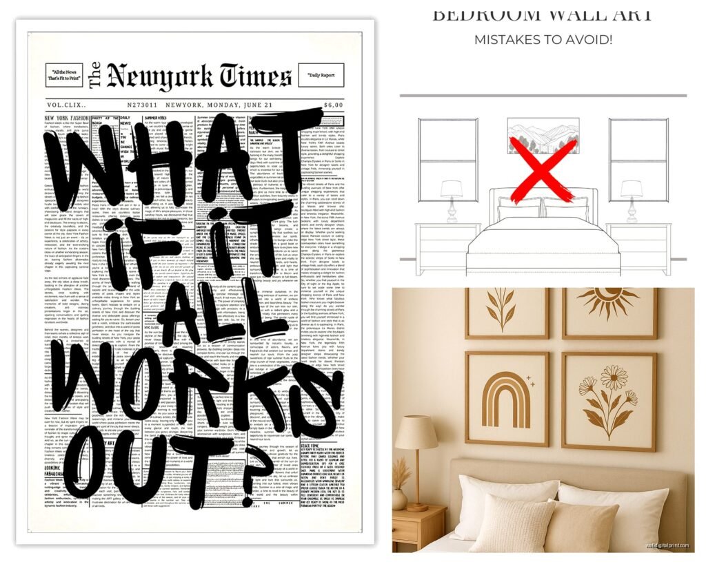
Placement Height and Spacing
This is where people mess up constantly. The center of your artwork should be at eye level, which is usually around 57-60 inches from the floor. But in a bedroom you’re often looking at it while lying down, so you can go slightly lower – like 54-56 inches to center.
Above the bed, leave about 6-8 inches between the top of your headboard and the bottom of the frame. More than that and it starts floating, less and it feels cramped. I use this measurement for basically every bedroom project and it works.
For gallery walls, the whole arrangement should follow that eye level rule, not each individual piece. Map it out with paper templates first, seriously. My dog knocked over my coffee while I was doing this last week and I had to start over, but it’s still worth the effort.
Lighting Your Art
Nobody talks about this enough but lighting makes or breaks wall art. If you’ve got overhead lights that create shadows or glare on your art, it’s gonna look bad no matter how nice the piece is.
I usually recommend picture lights for statement pieces – those little LED strips or small fixtures that mount above the frame. They’re not expensive (like $30-50) and they make art look gallery-quality. Just make sure they’re warm-toned LEDs, not those harsh blue-white ones.
If that’s too involved, just make sure you’ve got good ambient lighting that doesn’t create glare. Matte finishes on prints help with this too instead of glossy.
Styles That Actually Work for Different Bedroom Vibes
For modern minimalist bedrooms, go with large-scale abstracts in 2-3 colors max. Black and white photography can work but it needs to be really subtle subject matter. I did an Ansel Adams-style landscape in a client’s modern bedroom and it was perfect.
Traditional bedrooms can handle more ornate frames and classical subjects. Botanical prints, soft still lifes, vintage maps. Just keep the colors muted – no bright primary colors unless that’s specifically your thing.
Boho spaces are where you can get more playful with it. Macrame wall hangings, woven textiles, eclectic gallery walls mixing prints and objects. I’ve got a small macrame piece next to my bed right now that adds texture without being art exactly.
Scandinavian/minimalist vibes need really simple line drawings or abstract prints with tons of white space. Think one continuous line forming a figure or face, that kind of thing. Less is definitely more here.
Seasonal Switching
This might sound extra but I actually swap out bedroom art seasonally and it’s a nice refresh without spending money on redecorating. Warmer tones for fall/winter (terracotta, rust, warm browns), cooler tones for spring/summer (blues, greens, soft grays).
You don’t need multiple sets of expensive art – just have 2-3 affordable prints you can rotate. Makes the space feel different without major effort.
Budget Breakdown for Different Approaches
If you’ve got like $100 total, go with 2-3 smaller prints from Society6 or Desenio and put them in Target frames. You can get a decent look for under budget if you’re strategic about it.
$200-300 range is where you can get one really nice large piece from Minted or a small gallery wall with better quality prints. This is the sweet spot honestly – enough to get something good but not breaking the bank.
Over $500 and you’re looking at original art from Etsy or local artists, high-end prints with custom framing, or investing in a statement piece that’ll last years. I think this is worth it if you’re staying in your place long-term, but probably overkill for a rental.
DIY Options That Don’t Look DIY
If you’re crafty, oversized abstract art is surprisingly easy to make. Get a large canvas from Michael’s, some acrylic paints in your colors, and just… go for it. Abstract is forgiving because there’s no wrong answer. I made one during lockdown that’s still in my guest bedroom and people always ask where I got it.
Fabric wall hangings are another good DIY route. Find a fabric you love, get a curtain rod or dowel, hem the top to create a pocket, and hang it. Costs maybe $30 and looks intentional.
Pressed botanical prints are also doable if you’re patient. Press flowers or leaves, arrange them on nice paper, frame in a floating frame. Very cottage-core but it works for certain bedroom styles.
What to Avoid Completely
Okay so some things just don’t work in bedrooms no matter what:
- Mirrors above the bed – feng shui aside, it’s just weird energetically
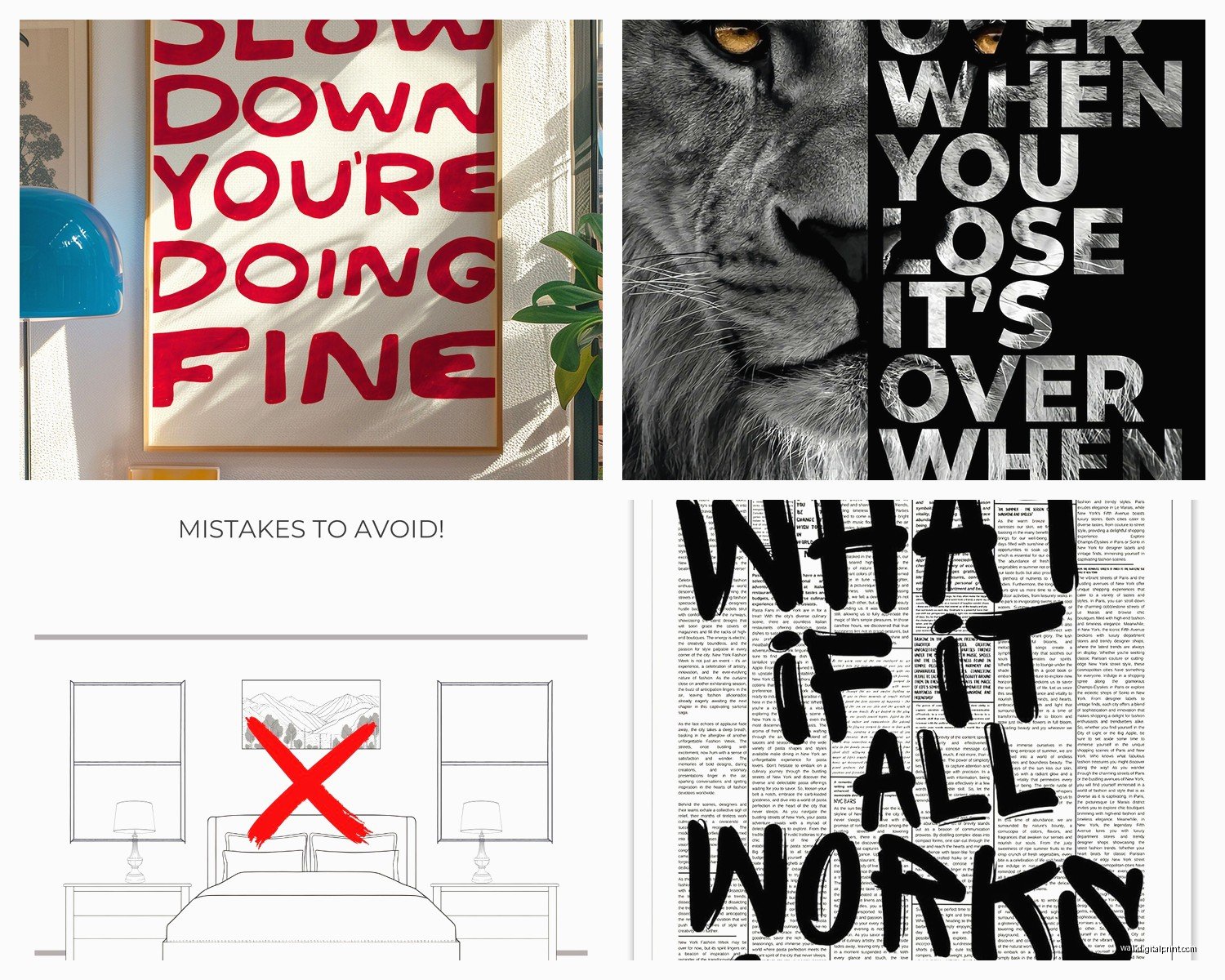
- Anything with words unless it’s subtle – motivational quotes are nightmare fuel
- Family photos directly above the bed (fine on other walls though)
- Super bright neon colors or high-contrast patterns
- Anything that reminds you of work or stress
Also gonna say this – those mass-produced “Live Laugh Love” type pieces from HomeGoods? Just no. They make your space look generic and they’re not even cheaper than getting something unique online.
The Rental-Friendly Approach
If you can’t put holes in walls, there are solid workarounds. Command strips work for lighter pieces under 5 pounds – just follow the weight limits exactly. I’ve used them in rentals and they hold up fine if you’re not constantly adjusting things.
Leaning large frames on furniture or the floor against the wall is actually a whole aesthetic now. Get a big piece, lean it on your dresser or nightstand. Looks casual and collected.
Picture rails or molding hooks if your rental has them – these are underutilized. You can hang art from the molding without putting holes in the actual wall.
The biggest thing is just starting somewhere instead of leaving walls blank because you’re overwhelmed by options. Even one piece above your bed changes the whole feel of the room. You can always swap it later if it’s not working, and honestly you probably will because I’ve never gotten bedroom art perfect on the first try.