Wall Art Guide, Wall Art Tutoriels
Extra Large Metal Wall Art: Oversized Sculpture Statement
May
So I’ve been working with these massive metal wall pieces for like three years now and honestly the first time a client asked me to install one I was terrified. We’re talking about a 6-foot abstract sculpture that weighed probably 80 pounds and I’m standing there with my measuring tape thinking “this is either gonna look incredible or like I dragged something in from a junkyard.”
The thing nobody tells you about extra large metal wall art is that size is actually your friend here. Like, you’d think bigger = harder to place, but it’s the opposite? A huge piece gives you permission to be bold and actually makes decorating easier because it does all the heavy lifting. My cat knocked over a plant while I was writing this but anyway—
Figuring Out What Size Actually Works
Okay so “extra large” is subjective and stores lie about dimensions all the time. What I consider oversized sculpture statement pieces:
- Minimum 36 inches in any direction (height or width)
- Most of my favorites are 48-72 inches wide
- Anything over 60 inches becomes architectural, not just decorative
Here’s my weird rule that actually works—your metal piece should take up about 60-75% of the wall width you’re putting it on. I learned this the hard way when I centered a 40-inch piece on a 12-foot wall and it looked like a postage stamp. Had to order a second piece to flank it and the whole thing became this expensive lesson.
For height, if you’re going above a sofa or console table, the art should be roughly two-thirds to three-quarters the width of the furniture. But with metal sculptures you can break this rule more than with framed art because the negative space and dimensional quality reads differently.
Weight Is Gonna Be Your Real Problem
This is where people mess up constantly. Metal wall art isn’t like hanging a canvas print. We’re talking serious weight:
- Small-ish pieces (36-40 inches): 20-40 pounds usually
- Medium oversized (48-60 inches): 40-70 pounds
- Actually massive (60+ inches): 70-150+ pounds depending on gauge and design
I had this geometric sunburst piece last year that the listing said was 52 pounds but when it arrived it was closer to 75. My assistant and I could barely get it out of the packaging. You need to know the actual weight because your wall anchors depend on it.
Drywall alone won’t hold anything over like 15 pounds safely. You’re gonna need:
- Stud mounting for anything heavy (find those studs with a good finder, not the cheap one from the checkout lane)
- Heavy duty toggle bolts rated for 100+ pounds if you can’t hit studs
- French cleats for pieces over 60 pounds—this is the museum-grade method
- Sometimes the manufacturer includes hanging hardware but it’s usually garbage, replace it
The French Cleat Method Nobody Uses But Should
Okay so funny story, I refused to learn French cleats for years because they seemed complicated. Then I installed a 90-pound metal tree sculpture using toggle bolts and it fell off the wall at 2am. The sound was like a car crash. The client was surprisingly cool about it but I learned French cleats that week.
It’s basically two interlocking pieces of wood or metal mounted at opposing angles. One goes on the wall (screwed into studs), one goes on the back of your art. They hook together and distribute weight evenly. You can buy cleat kits online or make them from plywood. For anything over 50 pounds, just do this method. Your insurance and your reputation will thank you.
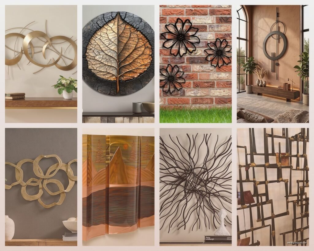
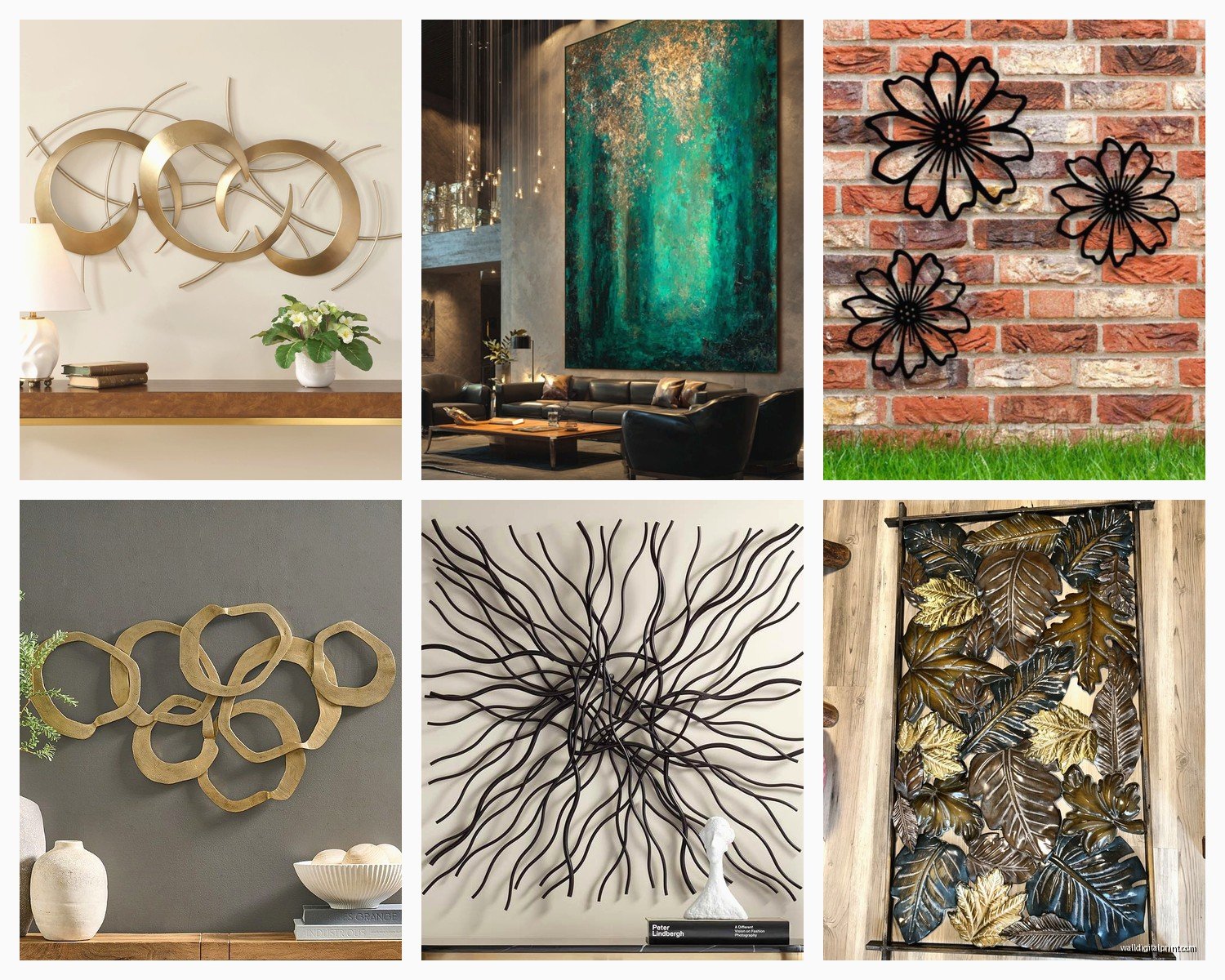
Styles That Actually Work in Real Rooms
I’ve tested a ton of different metal art styles and some just perform better than others in real spaces:
Abstract geometric patterns are the most forgiving. Those interlocking circles, angular lines, mountain silhouettes—they work in modern, transitional, even slightly traditional spaces. I put a copper-finish geometric piece in a client’s Tudor revival home and it somehow worked because the lines echoed the timber framing.
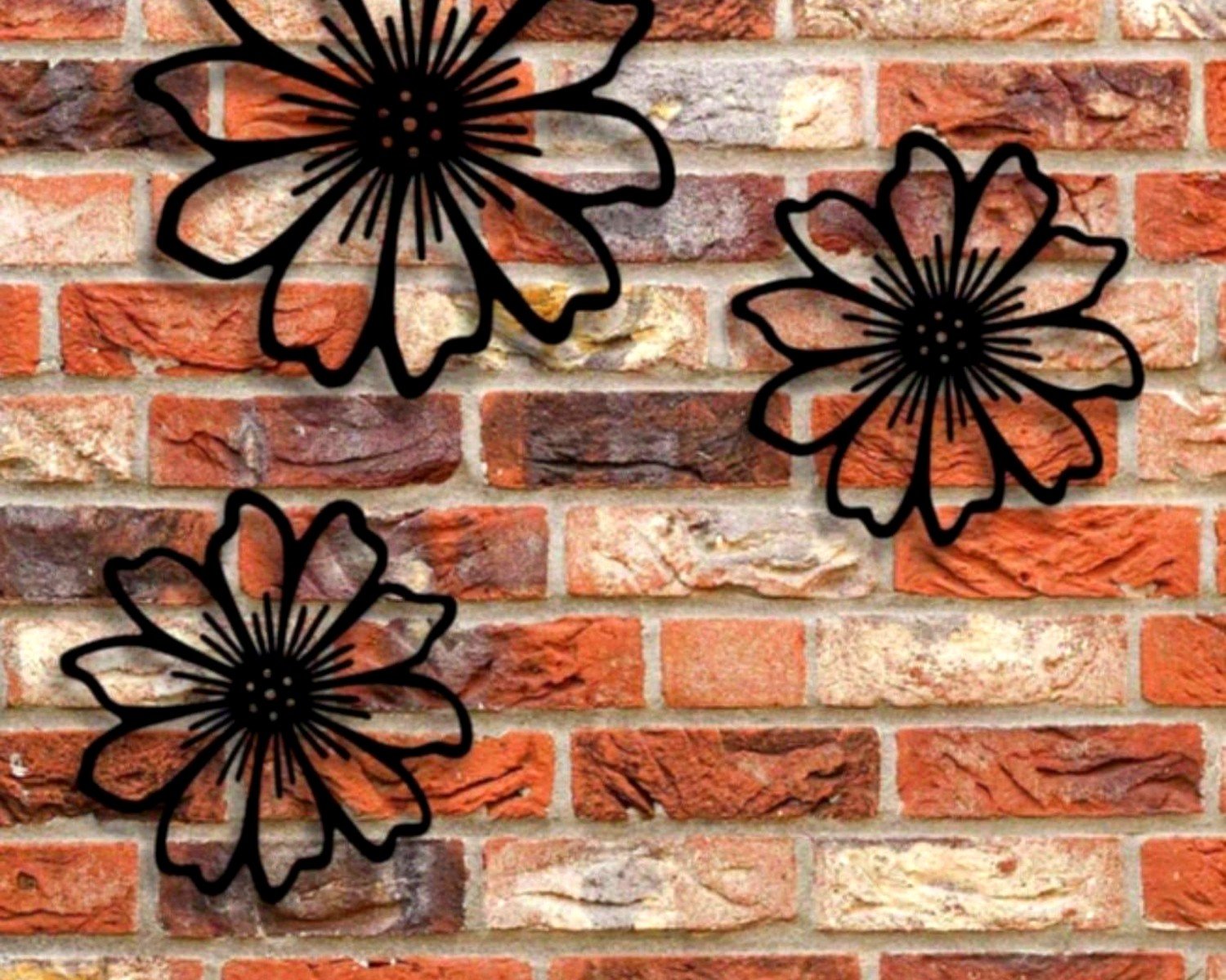
Nature scenes and trees are super popular but can look dated fast. The trick is finding ones with clean lines rather than too much detail. A simple tree silhouette in matte black? Timeless. A tree with every single leaf cut out in bronze finish? Gonna look like a Bed Bath & Beyond clearance section in five years.
Sunburst and mandala designs have serious impact but you gotta commit. These read very bohemian or glam depending on finish. Gold sunburst = glam. Weathered bronze mandala = boho. I watched three episodes of that baking show while deciding between two sunburst pieces for a client and honestly the decision came down to which one had better welding on the back.
Industrial and architectural pieces with gears, building silhouettes, bridges—these are amazing for lofts, offices, masculine spaces. But they’re hard to balance in softer rooms. I tried putting a cityscape piece in a bedroom once and the client said it gave her anxiety, so we moved it to the home office.
Sculptural abstract forms are my personal favorite. These are the pieces that look like actual sculpture mounted on the wall—organic shapes, dimensional layering, sometimes mixed materials. They’re art investments, not just decoration.
Finish and Color Because That Changes Everything
The metal finish dramatically affects how a piece reads in your room:
Matte black is the most versatile. Works with literally any color scheme. Doesn’t compete. Can look modern or traditional depending on the design. This is my go-to recommendation when clients are nervous.
Brushed or polished silver/chrome reads very contemporary and can feel cold. Great for modern spaces with lots of white, glass, concrete. Terrible in warm traditional rooms. Also shows dust like crazy—nobody mentions this.
Copper and bronze finishes add warmth and work beautifully in transitional spaces. They pick up ambient light in interesting ways. The oxidized copper pieces with that green patina can look expensive or cheap depending on quality—check reviews with photos.
Gold and brass tones are having a moment but tread carefully with extra large pieces. A huge gold mandala can overwhelm. Better in smaller doses or mixed with other metals in the same piece.
Painted or powder-coated colors are fun but limiting. I’ve used teal, burgundy, and navy pieces successfully, but they lock you into a color scheme. Your wall color becomes critical.
Placement Strategy That Actually Looks Intentional
The biggest mistake is centering everything. Sometimes yes, but often no.
Above the sofa: This is the obvious spot but height matters more than you think. Bottom of the art should be 6-10 inches above the sofa back. I see people mount it way too high constantly. You want visual connection between furniture and art.
Dining room: Huge metal pieces work amazingly here, especially abstract or nature scenes. They fill vertical space in rooms that often feel too tall. Center it on the wall, not necessarily the table, because furniture moves but wall proportions don’t.
Stairway walls: This is where oversized metal art really shines because you have the height. Follow the angle of the stairs with your installation—the piece should feel like it’s climbing with you. Measure from the stairs, not from the ceiling.
Double-height spaces: If you have a two-story entryway or great room, this is your moment for something truly massive. But it needs to relate to the ground floor somehow—ideally visible from the main seating area. I installed a 7-foot metal world map in a client’s double-height foyer and it’s the first thing everyone mentions.
Bedroom above the bed: Controversial take but I love oversized metal here. It’s unexpected. Keep it lighter in visual weight—airy designs, not solid heavy forms. And definitely secure it really well because the psychological factor of heavy objects above where you sleep is real.
What to Look for When You’re Actually Shopping
Quality varies wildly and you can’t always tell from photos:
Check the gauge of the metal. Thicker = more substantial = usually better quality. Cheap pieces use thin metal that can bend or look flimsy. Look for 16-gauge or thicker for larger pieces.
Welding and joints should be clean. If you can see in the product photos, zoom in on where pieces connect. Sloppy welds look DIY in a bad way.
Mounting hardware should be integrated or at least included and substantial. If the listing says “hanging hardware not included” for a 60-pound piece, that’s a red flag about overall quality.
Read reviews with photos specifically. Lighting in professional shots lies. Customer photos in actual rooms tell the truth about color, scale, and finish quality.
Price Ranges From My Experience
- Budget tier ($80-200): These exist and some are fine for rentals or temporary spaces, but expect thin metal, basic designs, finishes that don’t quite match photos
- Mid-range ($200-500): Sweet spot for most people. Good quality, interesting designs, finishes that look like the photos. This is where I shop for most clients.
- Investment ($500-2000+): Gallery-quality pieces, often handmade or limited production. Better materials, unique designs, finishes that develop character over time. Worth it for statement spaces.
I bought a mid-range piece for my own living room for like $340 and it’s held up perfectly for two years. Meanwhile a client bought a $95 “deal” and it arrived bent and the finish was already chipping.
Installation Tips From Someone Who’s Done This Too Many Times
Get help. Seriously, these pieces are awkward even when they’re not super heavy. The size makes them unwieldy and you can’t judge level and placement while you’re holding 50 pounds of metal.
Use a laser level if you have one. Regular bubble levels work but for pieces this large, being off by even a degree is really noticeable.
Make a paper template first for really large pieces. Tape up kraft paper or newspaper cut to size. Live with it for a day. Adjust the placement. Then commit to drilling.
Pre-drill your holes. Metal doesn’t forgive mistakes and patching drywall under these pieces is miserable because they’re so heavy to remount.
oh and another thing—consider the wall texture. Heavy textures like skip trowel or heavy knockdown can prevent the art from sitting flush. Sometimes you need to add spacers or shims behind mounting hardware.
Styling Around Your Giant Metal Piece
Once it’s up, everything else should support it, not compete:
Keep the wall color simple. White, gray, navy, charcoal—these let metal art pop. I tried putting a copper piece on a terracotta wall once and it was too much warm tone fighting for attention.
Flank with simpler elements if you’re doing a gallery situation. Like one massive metal sculpture in the center with two smaller framed prints on either side. Or plants. Plants work with everything.
Lighting makes such a difference. Wall washers or picture lights bring out the dimensional quality. I installed uplights below a massive geometric piece and the shadows it cast became part of the art.
Don’t overdo the metal theme. One statement metal piece per room max. If you have metal art, metal furniture, metal accessories—it becomes a theme, not a design choice.
Wait I forgot to mention—some metal art comes in multi-panel sets. These can be really impactful but installation is three times harder because you need consistent spacing and alignment across all panels. Measure everything twice. Use painters tape to mark where each piece goes before you drill anything.
The best oversized metal wall art feels like it’s always belonged there. It shouldn’t scream “I bought wall art.” It should feel like an architectural element that just happens to be removable. That’s when you know you got it right.