Wall Art Guide, Wall Art Tutoriels
Family Wall Art: Personalized Photo & Quote Displays
Jun
So I just finished redoing my sister’s hallway and honestly the family wall art thing is not as complicated as Pinterest makes it look, but there are definitely things I wish someone had told me before I started drilling random holes everywhere.
Figure Out Your Wall Space First (Like Actually Measure)
Okay so this sounds obvious but you need to really look at your wall and measure it. I’m talking width, height, and like… where are your light switches, because I cannot tell you how many times I’ve planned this perfect gallery wall only to realize there’s a thermostat right in the middle of where I wanted to put the biggest frame. Get painter’s tape and actually map it out on the wall. I know it seems extra but my friend Jamie skipped this step and ended up with a gallery wall that was weirdly off-center and she lived with it for two years before finally fixing it.
The rule I usually follow is your gallery wall or photo display should take up about two-thirds to three-quarters of the wall space you’re working with. So if you’ve got a blank wall that’s 8 feet wide, you’re looking at a display that’s roughly 5 to 6 feet across. But honestly that’s more of a guideline than a rule because I’ve broken it plenty of times when the space called for it.
Frame Quality Actually Matters (Unfortunately)
I used to buy those cheap frames from the big box stores and look, they’re fine for like… a rental or if you’re gonna change things out constantly. But if you want something that’ll last and actually look intentional, you gotta invest a bit more. The frames from Framebridge are pricey but they’re custom-sized and the quality is really solid. I’ve also had good luck with Article’s frames, they’ve got this mid-century vibe that works with pretty much everything.
West Elm has decent frames too, especially their gallery frames in brass or matte black. They go on sale pretty regularly so don’t pay full price. Sign up for their emails because they send 20% off codes like every other week.
Oh and another thing, stick to like 2-3 frame colors max. I learned this the hard way when I mixed gold, silver, black, and natural wood all together and it looked like I just grabbed random frames from different rooms. Now I usually do all black with maybe one or two brass accent frames, or all natural wood. Way more cohesive.
The Matting Situation
White mats make everything look more expensive and professional, I don’t make the rules. Even a cheap print looks better with a white mat around it. You can get pre-cut mats on Amazon pretty cheap, or if you’re doing custom sizes, FrameDestiny does custom matting for way less than going to a frame shop. My local frame shop quoted me like $45 per mat and FrameDestiny was $12. Just saying.
Photo Printing Quality (Because Phone Screens Lie)
Your photos look amazing on your phone screen but that doesn’t mean they’ll print well. I learned this when I tried to print a photo I took on my iPhone from like 2015 and it came out super pixelated at 8×10. You need high resolution files, at least 300 dpi at the size you want to print.
For printing I’ve tried a bunch of places. Artifact Uprising is gorgeous but expensive, their prints have this really nice thick matte finish though. Mpix is what I use most often now, they’re the professional lab that a lot of photographers use and the quality is consistently good. Way better than like Walgreens or CVG printing, those can be hit or miss.
Snapfish is fine for smaller prints if you’re on a budget. They run sales constantly so never pay full price there either.
Test Print First
This is gonna sound weird but always do a test print of your most important photos in a smaller size first. I printed a whole bunch of 11x14s once and when they arrived the color was way more yellow than I expected. Could’ve saved myself like $80 if I’d done a 4×6 test first.
Layout Options That Actually Work
Okay so there are basically three layouts that work for family photo displays and everything else is just variations on these.
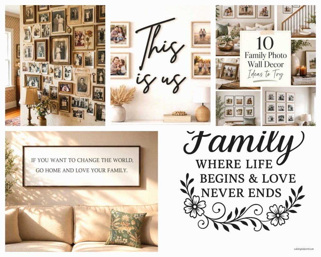
The grid layout is the easiest. Same size frames, arranged in even rows and columns. Super clean, very modern. I do this a lot in dining rooms or hallways. The trick is keeping your spacing consistent, I usually do 2-3 inches between frames. Use a level, use a measuring tape, don’t eyeball it no matter how confident you feel.
The salon wall is that asymmetrical gallery wall thing everyone’s doing. This one’s trickier because you need to balance visual weight. Bigger frames anchor the display, smaller ones fill in around them. What I do is lay everything out on the floor first and take a photo from above, then I can see if it looks balanced before I start making holes in the wall. My cat always tries to lay on the frames when I do this which is super helpful as you can imagine.
Then there’s the linear/horizontal layout where you just line up frames in a row. This works great over sofas or beds. Keep the center line of all your frames at the same height, usually about 57-60 inches from the floor which is standard gallery hanging height.
The Actual Hanging Process
Command strips work for lightweight frames but anything over like 5 pounds needs real picture hanging hardware. I use D-rings and picture hanging wire for most frames, with regular picture hangers on the wall. For heavier stuff, definitely find the studs or use proper drywall anchors.
There’s this thing called a picture hanging template you can buy on Amazon for like $15 and it’s basically paper templates that show you exactly where to put your nail for the frame to hang at the right spot. Saved me so much time and so many extra holes in the wall.
Wait I forgot to mention, if you’re doing a gallery wall, hang the middle frame first at eye level, then work your way out from there. Way easier than trying to start from one end.
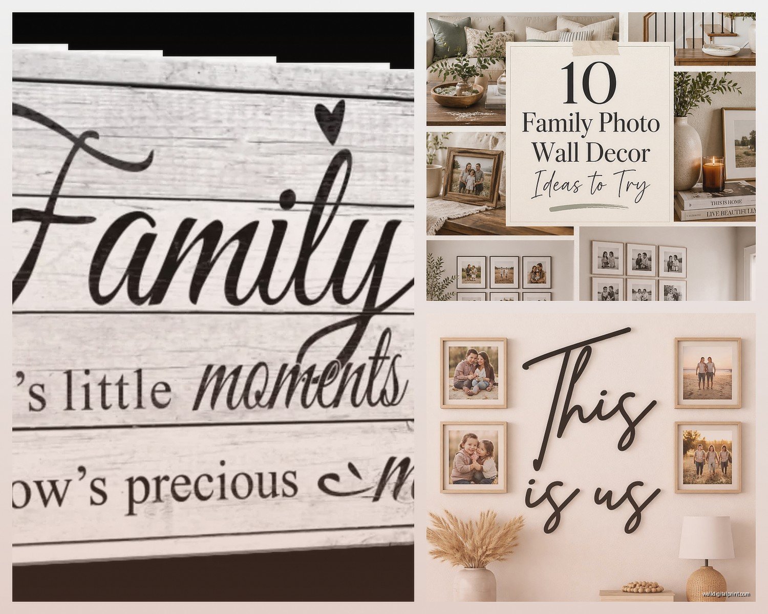
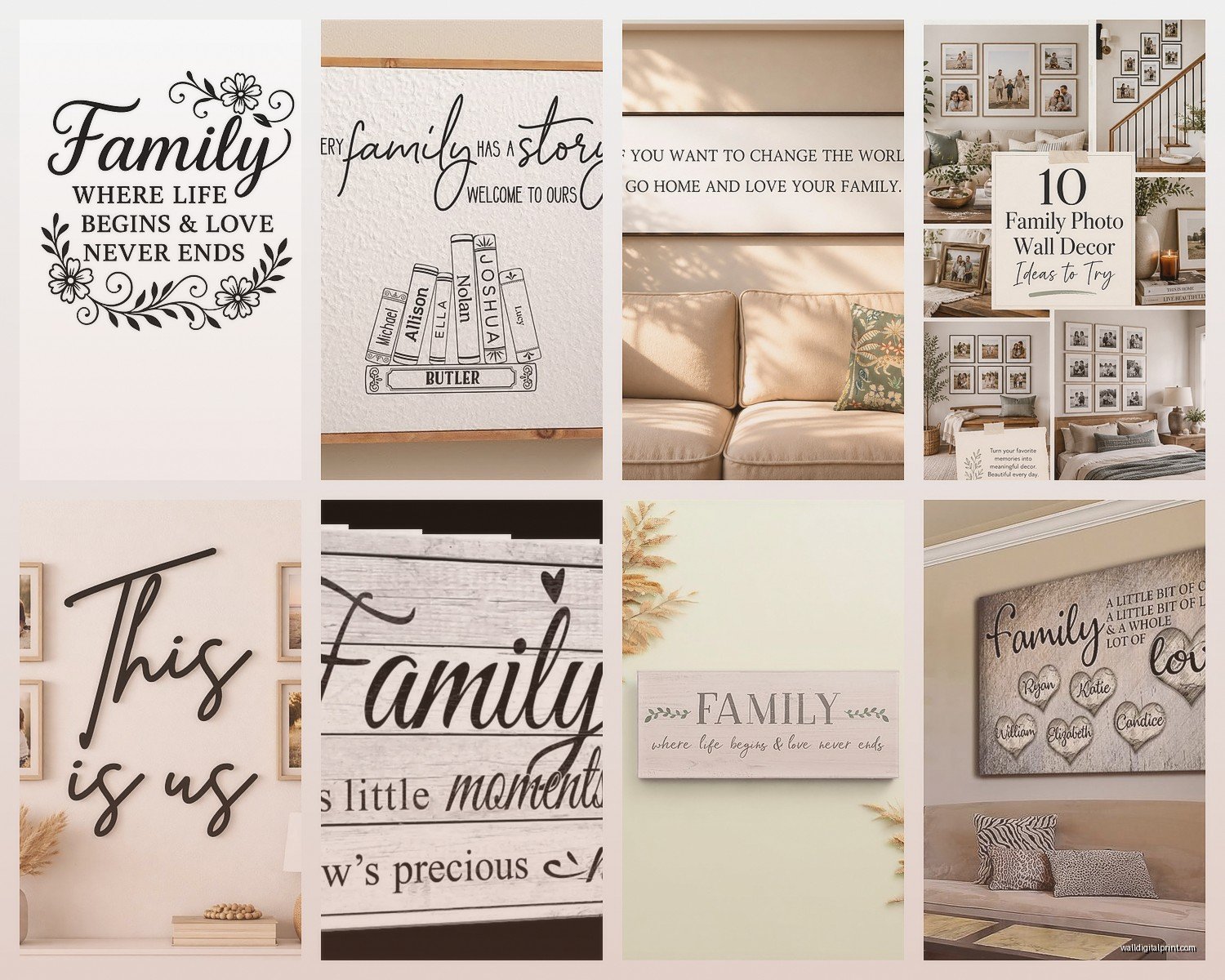
Mixing Photos and Quotes
So for the quote prints, Etsy is your friend. There are like a million shops selling printable quotes and you can usually get them instantly downloaded. I like the shops that offer multiple file formats because sometimes you need to adjust sizing. My go-to shops are TypeSecret and PrintableWisdom, they have more minimalist designs that don’t compete with your photos.
You can also make your own quote prints in Canva if you want something specific. I made one with my mom’s handwriting once by scanning a recipe card she wrote and turning it into a print, it’s probably my favorite piece in my own house.
The ratio I usually aim for is like 70% photos, 30% quotes/text/art. Too many quotes and it starts feeling like you live in a HomeGoods store. But a few mixed in breaks up all the faces and adds visual interest.
Color Coordination
Think about the colors in your photos when you’re planning this out. If you’ve got a bunch of photos with different color tones it can look chaotic. I sometimes convert some photos to black and white to create more cohesion. Or if everything’s in color, I try to pull photos that have similar color palettes, like all warm tones or all cool tones.
There’s this thing I do where I print the photos and lay them out with the quote prints before framing anything, just to see if the overall vibe works together. Sometimes I realize I need more black and white photos or that a certain quote print is too busy.
Lighting Makes or Breaks It
Nobody talks about this enough but lighting is huge. A beautiful gallery wall in a dark hallway just doesn’t hit the same. I installed some simple picture lights above my main gallery wall and it made such a difference. The Cocoweb LED picture lights are good and not crazy expensive. Or you can do what I did in my bedroom and just position a floor lamp to wash light across the wall.
Natural light is obviously ideal but watch out for direct sunlight because it’ll fade your photos over time. I learned this when some of my favorite prints got all washed out after like a year in a south-facing room. Now I use UV-protective glass for anything in really sunny spots, or I just avoid hanging precious photos there.
Updating and Rotating
One thing I tell everyone is don’t feel like your gallery wall has to be permanent. I swap out photos seasonally sometimes, or when I get new family photos taken. If you use the same frame sizes, you can just pop the backs off and switch the photos without rehanging anything.
I keep a little bin of backup prints that I can rotate in when I’m bored with what’s up. Makes it feel fresh without having to redo the whole thing. My client last month was worried about commitment with a big gallery wall and I showed her how easy it is to just change the photos, totally put her mind at ease.
Stuff That Didn’t Work For Me
Photo ledges seemed like a great idea but they collect so much dust and my house is apparently very dusty? Also they never looked as casual-chic as they do in magazines, they just looked messy.
Clipboards and string with clothespins for hanging photos, very cute in theory but it always ended up looking college dorm-ish to me. Maybe if you’ve got the right aesthetic but it wasn’t for me.
Those huge custom canvas prints of family photos, I dunno, something about them feels dated now. Like very 2010. If you love them that’s totally fine but I’m seeing people move away from those.
Okay I think that covers most of it. The main thing is just start somewhere and don’t overthink it too much. You can always move stuff around, that’s the beauty of it. I’ve redone my entryway gallery wall like four times now and it gets better each time because I figure out what works and what doesn’t. Just measure twice, drill once, and maybe have some spackle on hand for the inevitable mistakes.