
Wall Art Guide, Wall Art Tutoriels
Vintage Prints Wall Art: Retro Reproduction Poster Collection
Aug
So I’ve been obsessed with vintage prints lately and honestly it started because I found this incredible 1920s French perfume ad at an estate sale and now my apartment looks like a curated chaos of retro posters and I’m not even sorry about it.
Finding Actually Good Reproduction Prints
Okay so first thing, not all reproduction prints are created equal and I learned this the hard way. I ordered what looked like an amazing Toulouse-Lautrec poster from this random Etsy shop and it showed up looking like someone printed it on their home inkjet during a power surge. The colors were muddy, the paper felt like cardboard, and I was just… yeah, that went straight to the donation pile.
What you actually want to look for is prints that specify their printing method. Giclée prints are gonna be your best bet for color accuracy and longevity. They use archival inks that won’t fade into sad beige versions of themselves in two years. Lithographs are cool too if you’re going for authentic reproduction vibes since that’s how most vintage posters were originally made.
I usually check these sites when I’m hunting:
- AllPosters.com has a surprisingly decent vintage section
- Art.com for when I want something specific and don’t wanna dig
- Posterazzi is great for historical stuff
- Vintage poster dealers on Etsy but you gotta vet them hard
- Museum shops, especially MoMA and the Met, they have killer reproduction collections
What Eras Actually Work in Modern Spaces
This is gonna sound weird but not every vintage style translates well to contemporary interiors. I had a client who was dead set on these 1970s motivational posters with the sunset gradients and inspirational quotes, and in her minimalist loft they just looked… ironic? And not in a good way.
Here’s what I’ve found actually works:
1920s-1940s travel posters are basically foolproof. The Art Deco ones especially, with those clean lines and geometric shapes. I have a “Visit the French Riviera” poster in my hallway and people always think it’s way more expensive than it was. The colors are bold but not overwhelming, and they add this sense of adventure without being too literal.
Mid-century modern advertisements from the 50s and early 60s have that optimistic graphic design thing happening. Think bold typography, limited color palettes, lots of negative space. They work because they’re basically proto-minimalist if you squint.
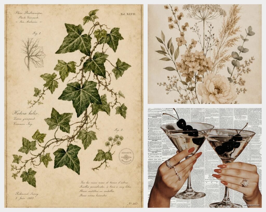
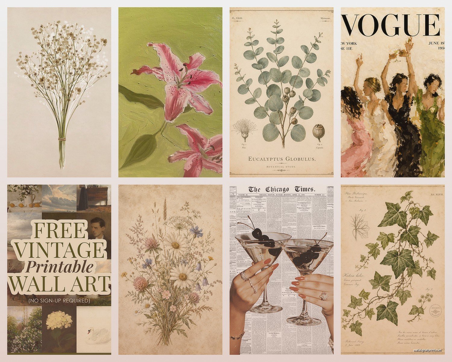
Botanical and natural history prints from the 1800s and early 1900s are having a moment and honestly they deserve it. They’re detailed enough to be interesting but neutral enough to not fight with your existing decor. I put three fern prints in my bathroom and it’s like a tiny Victorian conservatory situation.
The Ones That Are Trickier
Late 60s psychedelic stuff can go very wrong very fast unless your whole space is leaning into that vibe. Same with 80s neon anything, it needs to be intentional or it just looks like you’re stuck in a time warp.
Size and Scale Things I Wish Someone Told Me
Oh and another thing, the size thing is critical and I see people mess this up constantly. That poster that looks perfect on your laptop screen? It might be the size of a postage stamp in real life or weirdly it could be absolutely massive.
Standard vintage poster sizes were different than modern frame sizes which is annoying but here we are. Original vintage posters often came in weird dimensions like 24×36 or 27×41 for movie posters. Reproductions sometimes scale these down or up, so always check the actual measurements.
For reference, my living room has 10-foot ceilings and I learned that anything smaller than 18×24 just disappears on the walls. It’s like they’re being swallowed by the space. But in my bedroom which is smaller and cozier, I have a gallery wall of 11×14 prints and it feels perfectly balanced.
My general rules that I totally made up but they work:
- Large wall above a sofa: go for 24×36 minimum or do a set of three smaller ones
- Hallways: 16×20 or 18×24 works nicely, you don’t want huge
- Gallery walls: mix sizes but keep them in the same family, like 8×10, 11×14, 16×20
- Statement piece: 30×40 or bigger if you want people to actually notice it
Framing Without Spending Your Entire Paycheck
So framing is where this hobby can get expensive real fast. Custom framing shops will quote you like $200-400 per print and listen, sometimes that’s worth it for special pieces, but for a collection? No way.
I use IKEA frames way more than I probably should admit as an interior stylist. Their RIBBA and SILVERHÖJDEN frames are actually pretty decent and come in standard sizes. The key is making them look intentional by keeping them consistent, either all black or all wood or all white.
Target’s Threshold frames are good too and usually cheaper than IKEA if you catch them on sale. I got six 18×24 frames for like $15 each last year.
Wait I forgot to mention, if your print is an odd size, you can use a mat to make it fit a standard frame. I do this constantly. Buy a cheap pre-cut mat or cut one yourself if you’re feeling ambitious, my cat knocked over my mat cutter last week and I’m still finding tiny cardboard shreds everywhere but anyway, it works great for making a 20×28 print fit in a 24×36 frame.
When to Actually Invest in Good Framing
If you’re dealing with an actual valuable vintage print or something that means a lot to you, get it professionally framed with UV-protective glass and acid-free matting. I have an original 1960s Czech film poster that I absolutely splurged on the framing for because I knew I’d have it forever.
Color Coordination Without Making It Boring
This is where people get stuck. They want their vintage prints to “go together” but then everything ends up looking too matchy and loses that collected-over-time vibe that makes vintage stuff charming.
What I do is pick a color story but keep it loose. Like in my dining area I have all warm-toned prints, lots of oranges and yellows and browns, but the subjects are totally different. There’s a 1930s orange crate label, a French aperitif ad, and a botanical print of autumn leaves. They feel cohesive because of color but not boring because the styles vary.
Or you can go full chaos with all different colors but keep the era consistent. All Art Deco, all different colors. All mid-century, rainbow of hues. The consistent design language holds it together.
Subjects That Actually Matter
Okay so funny story, I once bought an entire collection of vintage cigarette ads because the graphics were stunning, and then I had to explain to everyone who came over that no, I don’t smoke, I just think the typography is beautiful. It got old fast and I sold most of them.
Pick subjects you actually connect with or at least don’t have to constantly justify. Travel posters are safe. Food and beverage ads are fun and conversation-starting without being weird. Botanical prints, fashion illustrations, transportation stuff like trains and ships, all good.
I’m really into vintage theater and opera posters right now. They have this dramatic flair but they’re also culturally interesting and there’s something kinda sophisticated about them without being pretentious? Maybe I’m lying to myself but I like them.
Building a Collection That Tells a Story
You don’t need a theme exactly but having some thread that connects things makes your wall art feel curated instead of random. My hallway is all travel posters from places I’ve actually been or want to go. My office has vintage book covers and publishing ads because I’m a nerd about that stuff.
Where This Can Go Wrong
Let me tell you about mistakes I’ve made so you don’t have to. I once bought twelve vintage prints in one weekend because they were on sale and I got excited, and then I had this pile of prints sitting in my closet for months because I had no plan for them. Don’t do that. Buy with intention or at least have a vague idea of where something might go.
Also, mixing too many eras in one space can look confused. Like having a 1920s Art Deco poster next to a 1980s Memphis Group thing next to a Victorian botanical… it’s just too much visual information. Pick one or two eras per room max.
And please for the love of everything, hang your prints at the right height. The center of the print should be at eye level, which is usually around 57-60 inches from the floor. I see so many people hang stuff way too high and it’s like they’re decorating for giants.
Caring for Your Prints
This is boring but important I guess. Keep them out of direct sunlight because even with UV glass, colors will fade eventually. I learned this when my favorite Alphonse Mucha reproduction got sun damage on one side and now it’s slightly lopsided in tone and it haunts me.
Dust the frames regularly. Use a microfiber cloth, don’t spray cleaner directly on the glass because it can seep behind and damage the print.
If you’re storing prints, keep them flat in acid-free sleeves or tissue paper. Don’t roll them if you can avoid it, but if you must, roll them print-side out around a tube that’s at least 3 inches in diameter.
The Actual Shopping Process
When I’m looking for specific prints, I usually start with a Google Image search to see what exists, then I track down where I can actually buy a decent reproduction. Museum websites are great for this, they often have high-quality reproductions of famous works in their collections.
Read reviews obsessively. If people are complaining about color accuracy or print quality, believe them. I always check if the seller includes photos of the actual print next to something for scale.
For Etsy sellers specifically, I message them with questions before buying. How is it printed? What kind of paper? Can they send additional photos? Good sellers respond quickly and thoroughly, sketchy ones don’t.
And honestly sometimes the best finds are at thrift stores and estate sales. Yeah you’re not getting a specific poster you had in mind, but you might find something incredible you didn’t know existed. I found a set of 1950s airline posters at an estate sale for $20 total and they’re worth way more but also I’m never selling them because they’re perfect.
Making It Look Intentional Not Dorm Room
The difference between vintage prints looking cool versus looking like a college apartment is mostly about presentation and restraint. Use real frames, not poster putty or pushpins, I’m begging you. Space things properly on the wall, don’t cram everything together.
Less is often more. Three really good prints displayed well will always look better than twenty random ones scattered around. Quality over quantity, etc.
And mix in some other elements. Vintage prints plus modern furniture creates tension in a good way. Or vintage prints plus plants plus interesting lighting. You want layers, not just walls covered in paper.
I’ve been watching this documentary about mid-century graphic design while writing this and I keep getting distracted but anyway, the main thing is just start with one or two prints you genuinely love and build from there, don’t try to create an entire collection overnight because you’ll end up with a bunch of stuff that doesn’t quite work together and then you’re stuck with it.
